Visit website
Effortel
19 views4mo ago
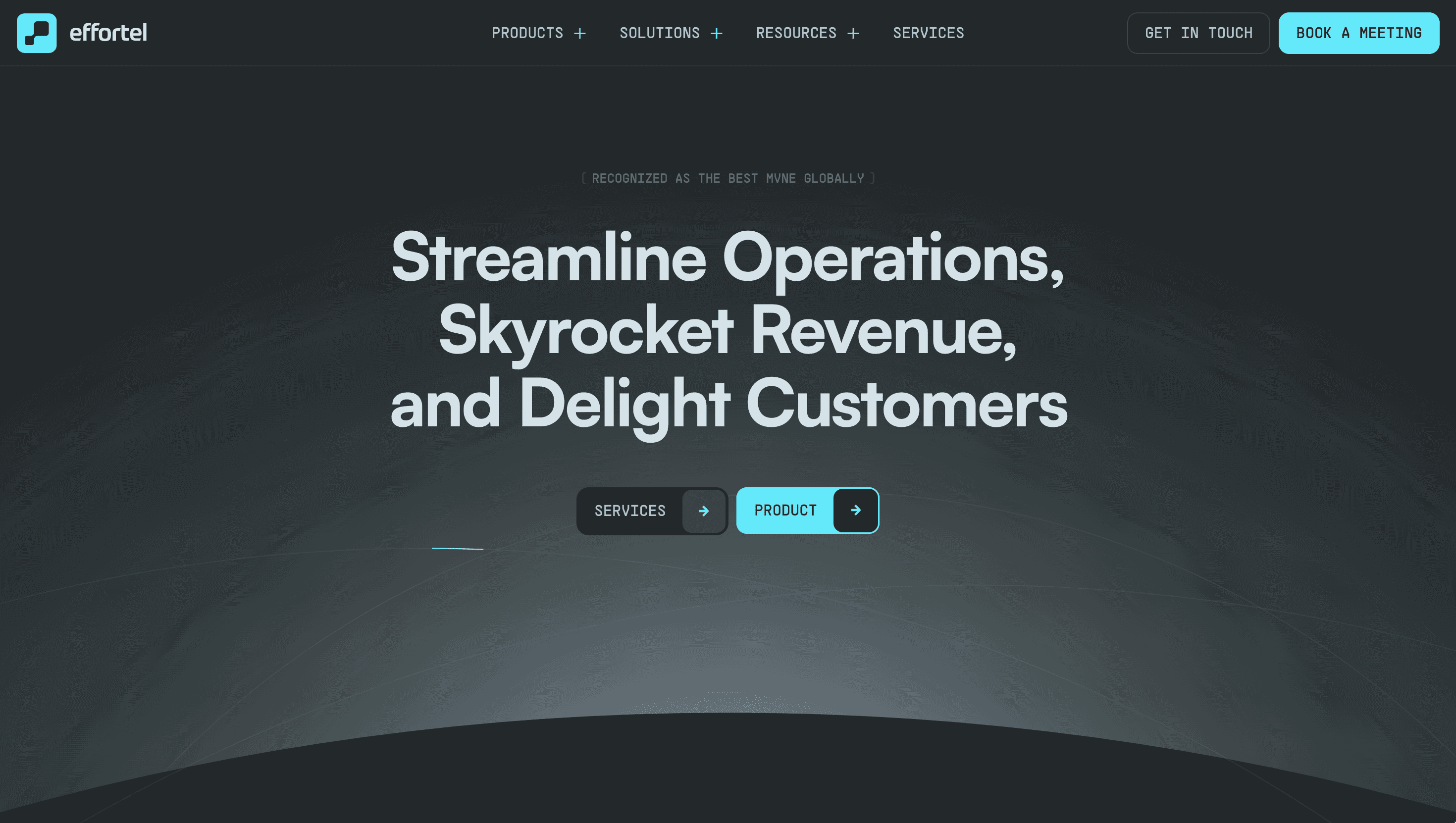
Concept
Effortel positions itself as a “network-in-a-box” for brands that want to sell mobile services without running a telco. The homepage funnels visitors through a three-step story Platform → Launches → Case Studies so operators, supermarkets and fintechs grasp the business case before they book a demo.
Visual Language & Motion
A royal-blue canvas nods to legacy telcos, while neon-aqua accents telegraph SaaS agility. Hero copy lands in bold geometric caps and fades to reveal a world map dotted with MVNO launch pins. Scroll and GSAP-timed cards slide up on a strict 12-column grid: architecture diagrams, client logos, KPI infographics. Micro-interactions signal bars that animate on hover, SIM cards that flip to show eSIM QR codes reinforce product intellect without overwhelming.
UX & Performance
SVG icon sprites and AVIF hero (< 350 KB) keep LCP ~1.1 s on desktop and 1.5 s on 4 G. IntersectionObserver preloads case-study images two sections ahead, preventing jitter. prefers-reduced-motion swaps slide-ups for fades, and all colour pairs hit WCAG AA. A sticky “Request Demo” bar collapses to a thumb-friendly pill under 480 px, shortening the funnel for on-the-go executives.
Takeaway
Effortel proves that B2B telecom can feel modern and succinct: restrained palette, performance budgets and evidence-first storytelling turn complex OSS/BSS into a clear, confidence-building proposition.
More Projects


Sponsor
Your ad here