Visit website

Reform Collective
16 views4mo ago
Concept
Reform Collective flips the usual client-agency dynamic: instead of hourly invoices, they exchange craft for cap-table space. The website presents that thesis like a kinetic pitch deck Why Equity → How We Work → Proof → Partner With Us moving founders from intrigue to handshake in a single, well-paced scroll.
Visual Language & Motion
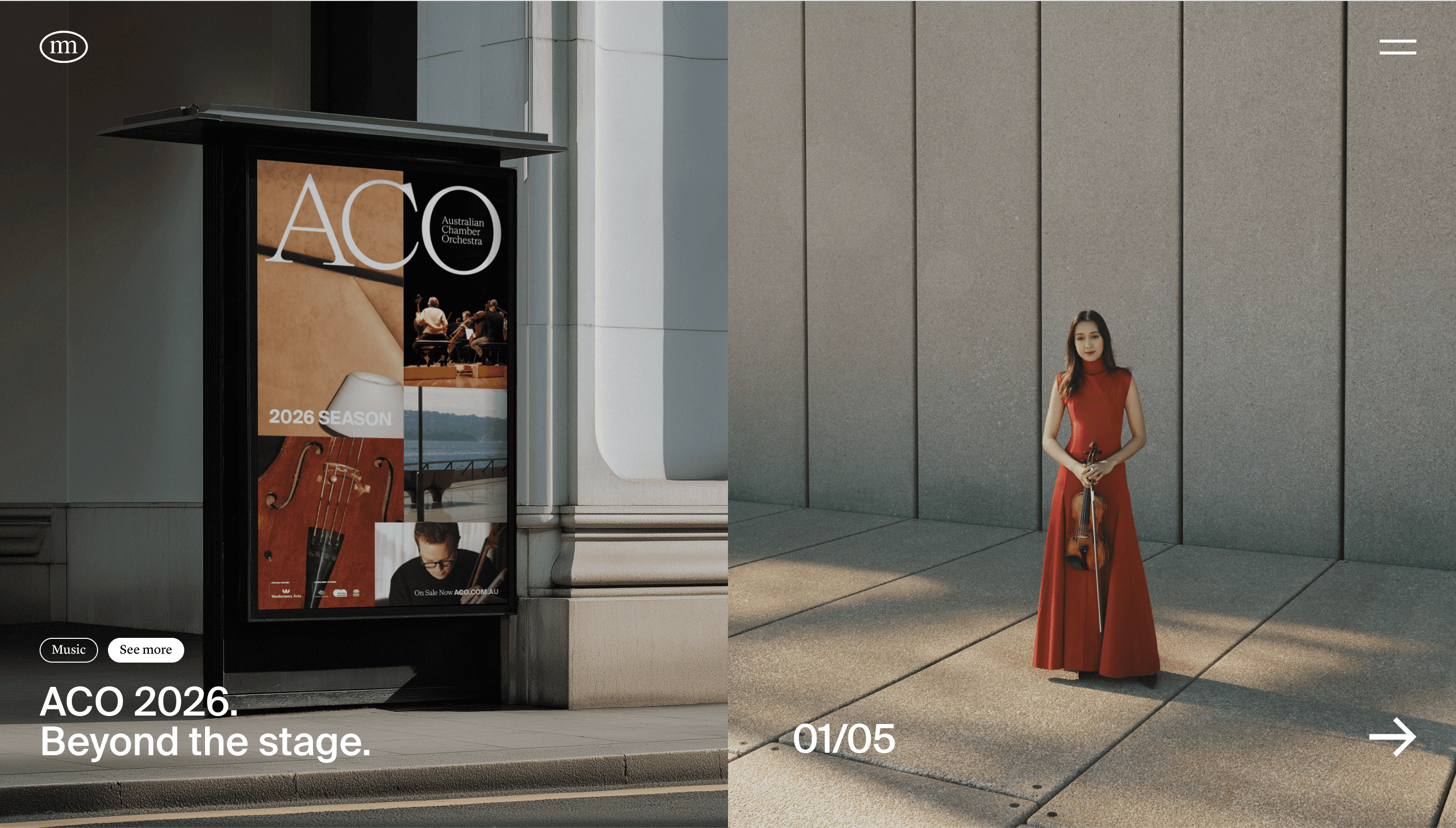
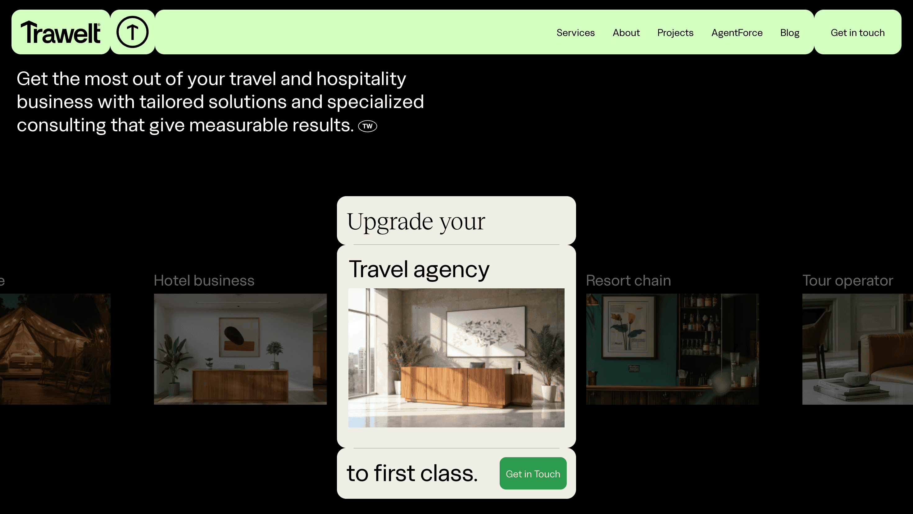
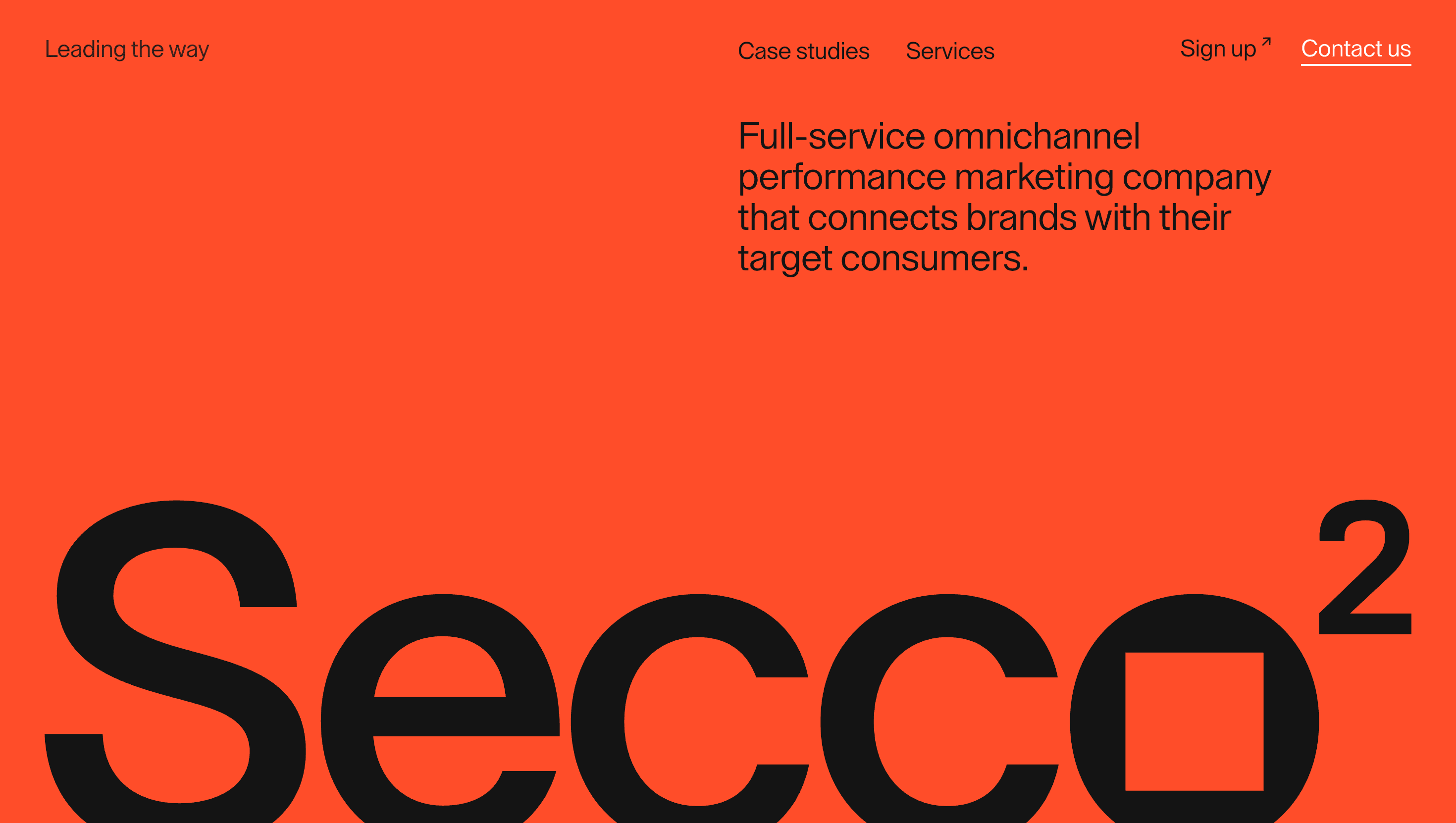
A graphite-black canvas lets color come only from case work Arlo cyan, Campfire orange, Thoughtly lavender so each project owns its moment without fracturing the brand. A bento-style grid clicks into place with GSAP spring easing; hover a tile and it blooms to full-bleed video, while the rest of the grid shrinks 2 px, imitating a camera rack-focus. Monument Grotesk XXL headlines stride across a 12-column rhythm; micro-icons (▲ ■ ●) map to the trio Strategy, Design, Code. Subtle grain overlays and ambient drop-shadows add texture against the slick dark UI, echoing the agency mantra “We live in the details.”
UX & Performance
Hero reels are AV1-encoded and lazy-load only on ≥ 1024 px screens; mobiles get poster frames, keeping LCP ≈ 1.2 s even on 4 G. IntersectionObserver prefetches the next case video two sections ahead for jitter-free playback. The sticky nav behaves like a tray: click “Menu” and the entire page slides down to reveal a full screen index, then springs back an effect polished enough to win Awwwards Site of the Day. prefers-reduced-motion freezes grid shifts to opacity fades, and all colour pairs surpass WCAG AA, critical for B2B trust.
Takeaway
Reform Collective proves a portfolio can demonstrate its own value proposition in real time: equity-based model, ruthless performance budgets, bento grid delight and WebGL flourishes merge into a narrative that feels less like browsing an agency site and more like previewing your future design partner.