Visit website
Bitter Creek Studio
21 views4mo ago
Concept
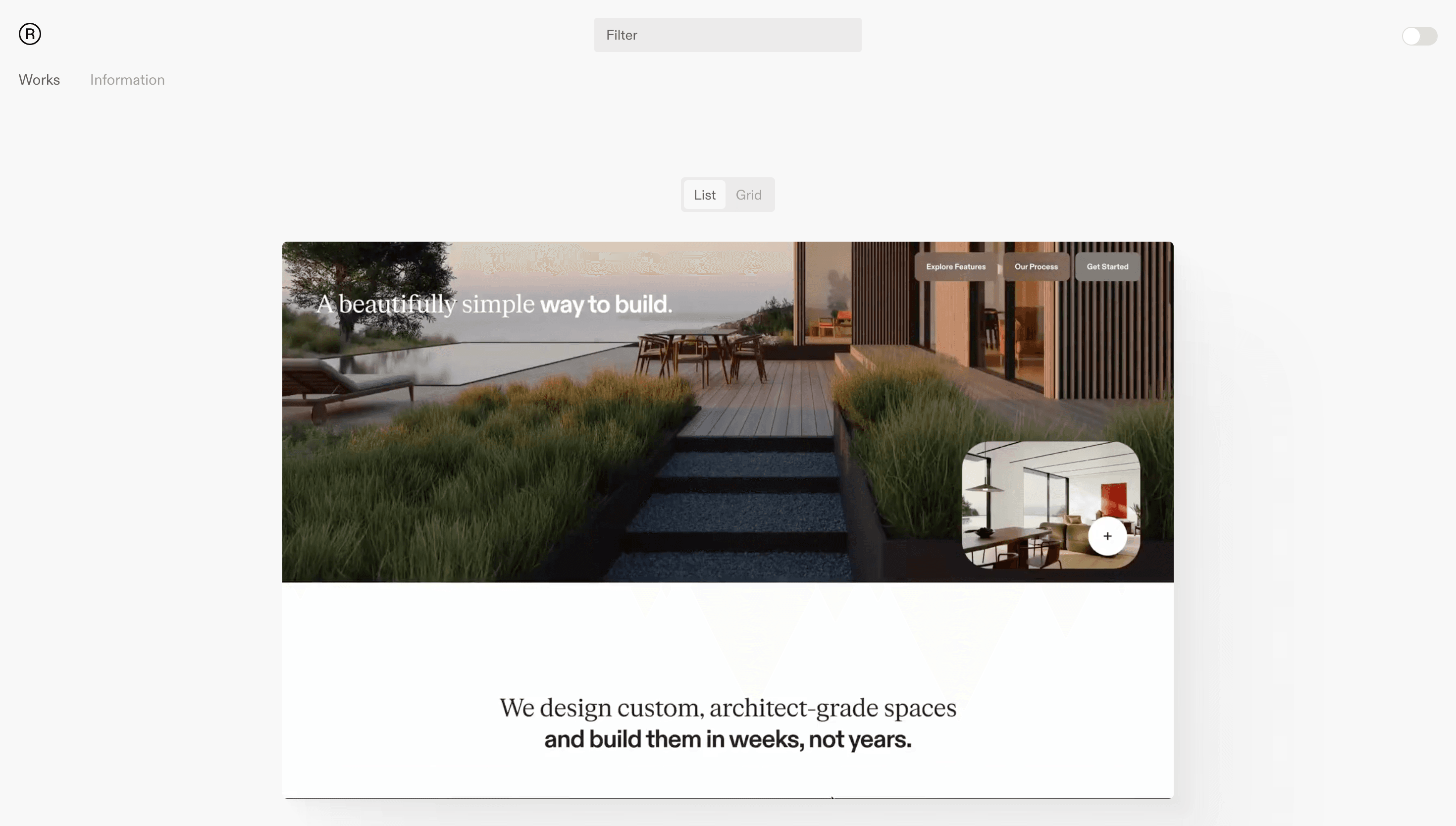
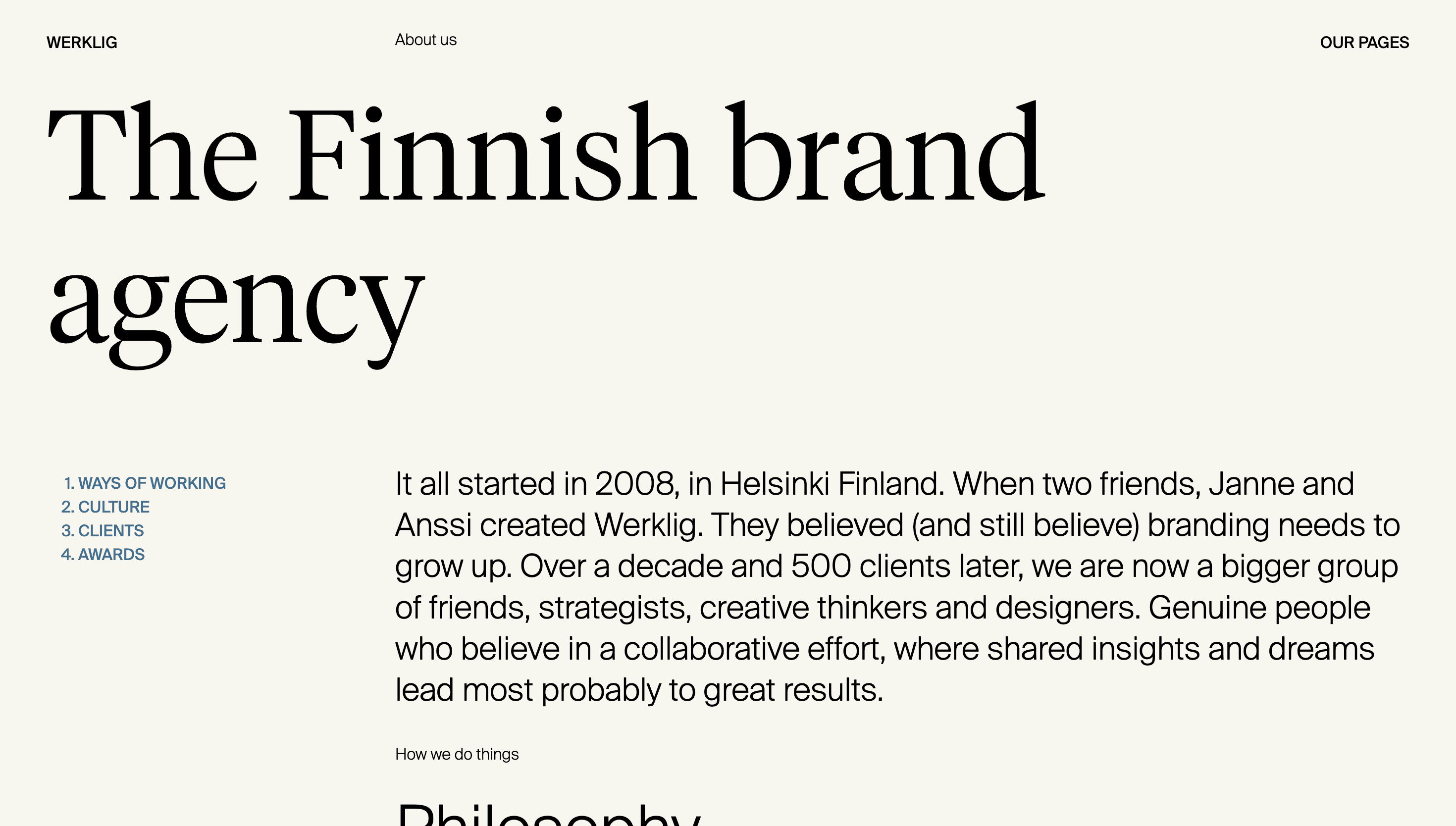
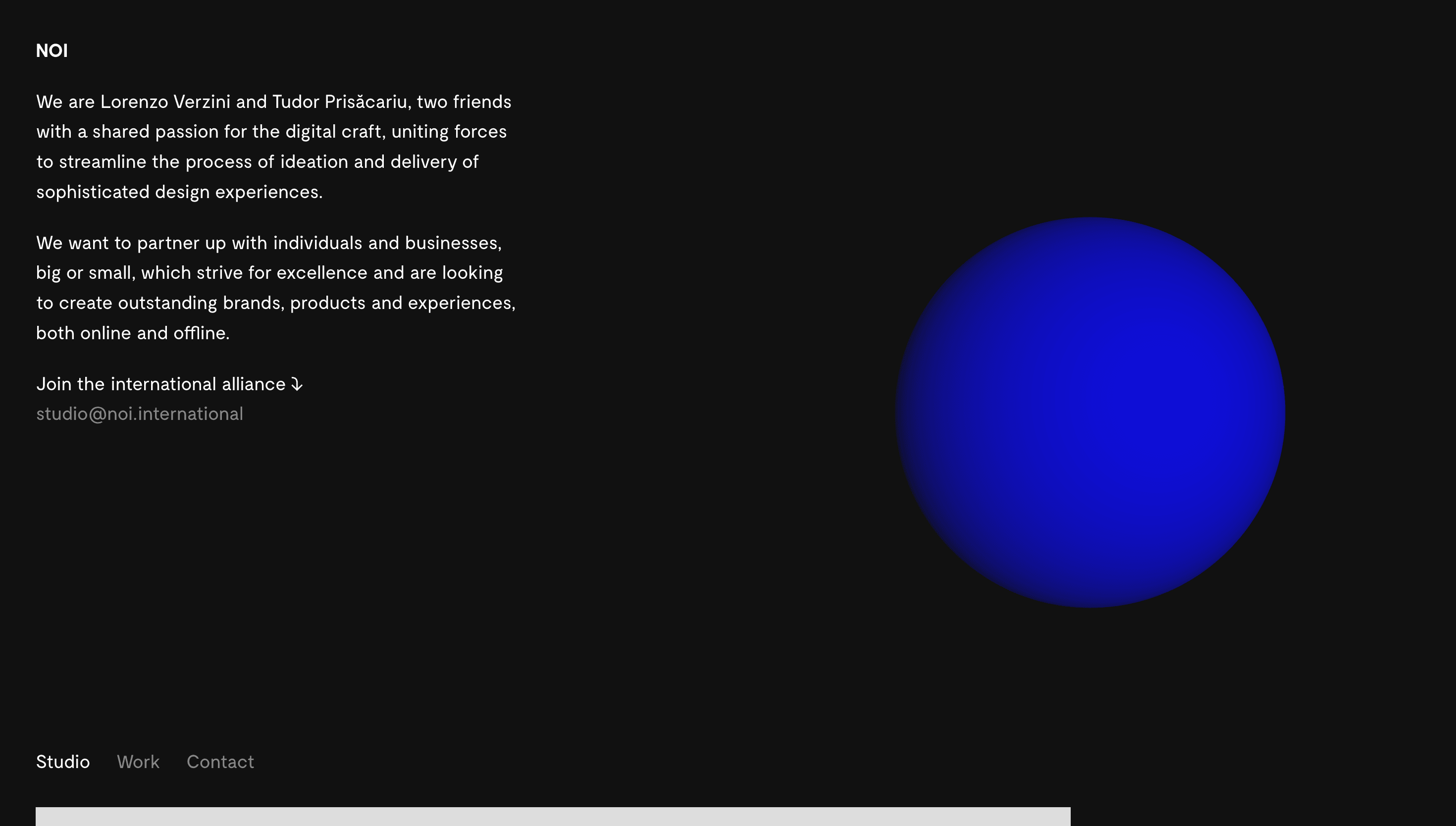
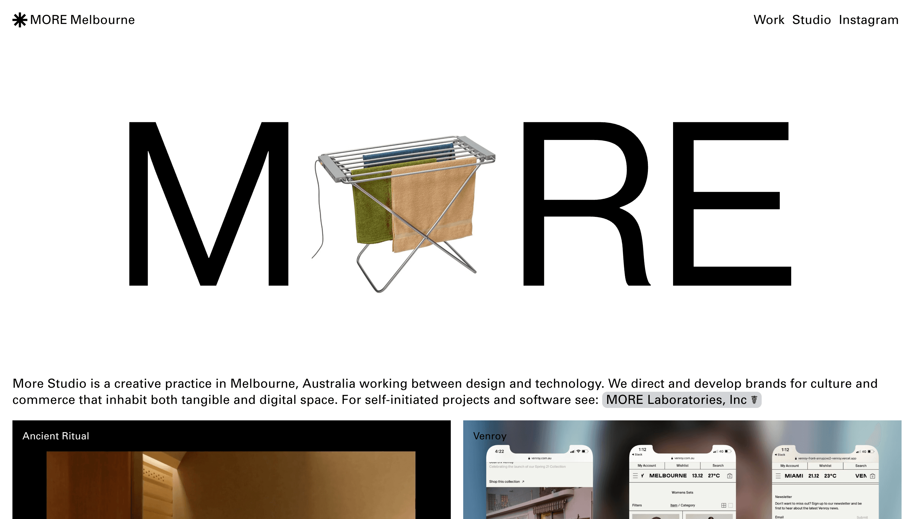
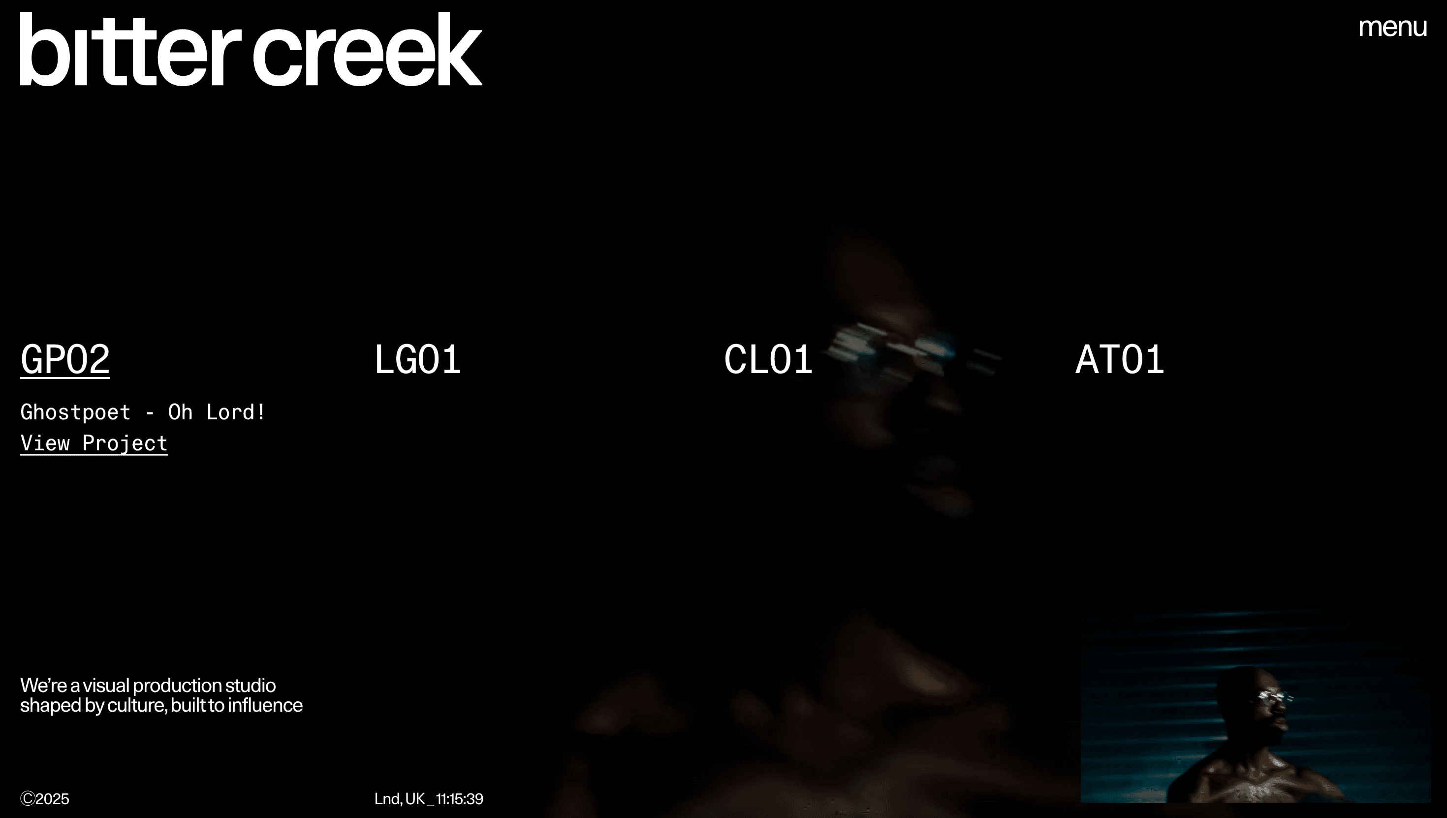
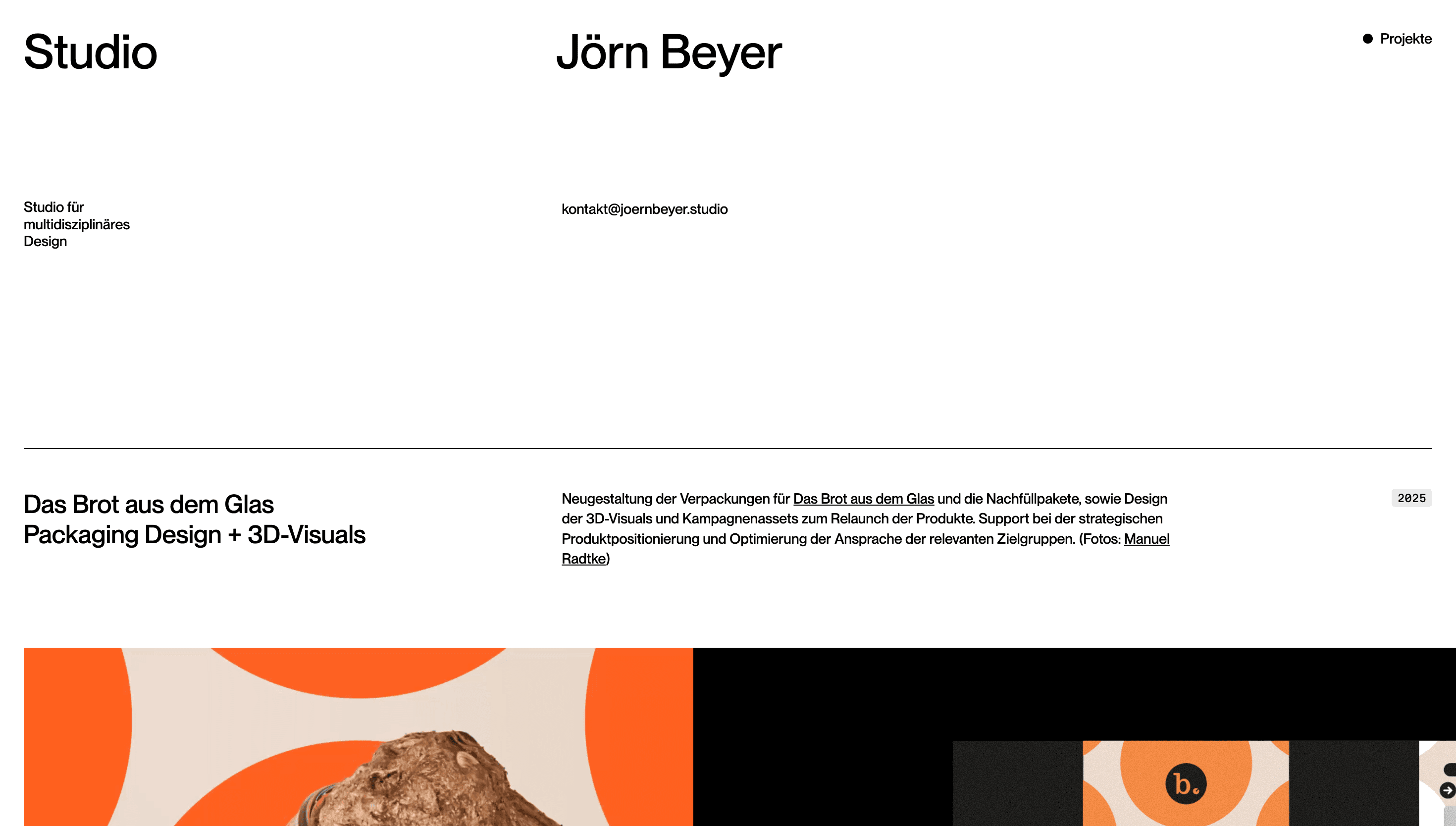
Bitter Creek Studio positions itself as a boutique shop where design and code grow side by side. The homepage reads like a hand-built scrapbook: bold serif headlines, whimsical illustrations and subtle motion cues introduce the studio’s philosophy before any case study appears. The story is one of intimacy—two people building things with care, in contrast to anonymous agency scale.
Visual Language & Motion
The visual system balances heritage and modernity. A dusty-cream background, slab-serif type and pencil-drawn icons recall Americana craft; hover effects and micro-interactions keep it lively and digital. Projects expand into rich, full-bleed showcases with expressive colour palettes—each client’s world is allowed to fully take over the frame. Motion is soft and analog-feeling: cards slide with spring easing, page transitions dissolve rather than snap, mirroring the duo’s human-first ethos.
UX & Performance
AVIF hero images (< 250 KB) load instantly, giving LCP ≈ 1.0 s on desktop and 1.4 s mobile. The structure is minimal—Work, About, Contact—with no excess navigation clutter. prefers-reduced-motion disables spring easing and uses fades, preserving comfort. Accessibility is built in: colour ratios meet WCAG AA, and tab order follows natural reading flow.
Takeaway
Bitter Creek Studio shows how small scale can be a superpower. By mixing craft aesthetics with contemporary digital performance, their site proves that two people with the right sensibility can create brand and web experiences as resonant—and often more soulful—than large agencies.
More Projects

Sponsor
Your ad here