Visit website
Kidsuper
20 views4mo ago
Concept
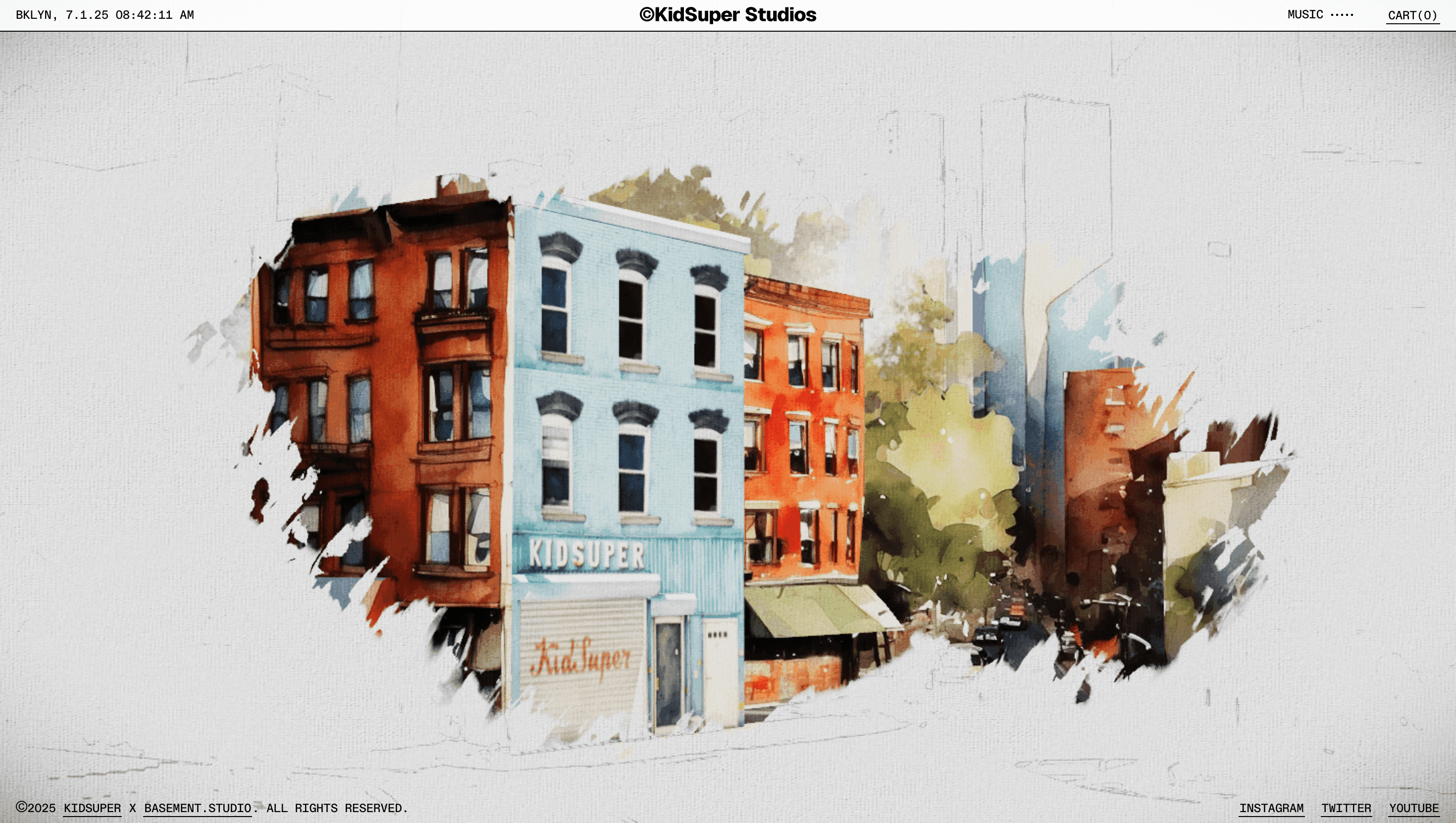
KidSuper sees clothing as “wearable artwork,” so the website behaves like an open studio where sketches, stop-motion vids and look-book runways spill onto one continuous canvas. Every scroll feels like riffling through Colm Dillane’s sketchpad—raw, playful and slightly chaotic, yet always intentional.
Visual Language & Motion
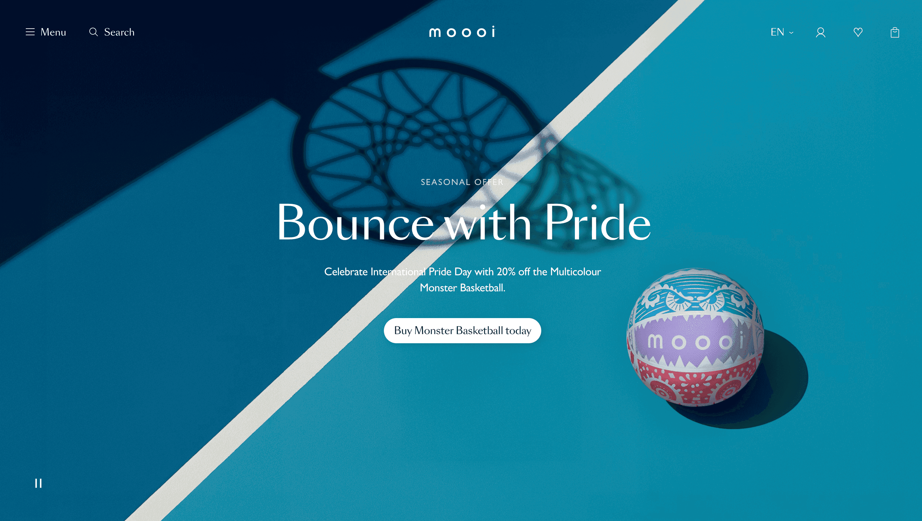
A riot of pastel pinks, canary yellows and marker-pen blues clashes against kraft-paper textures. GSAP-driven collage pieces pop in with overshoot easing, then drift lazily as parallax layers, evoking paper scraps on a worktable. Headlines shout in a condensed grotesque, while price tags appear as hand-written Post-its that wiggle on hover. The “Runway” section replaces thumbnails with looping VHS-grain clips of models sprinting down Brooklyn streets; clicking one triggers a full-bleed video player framed by doodled borders that animate like flip-book scribbles.
UX & Performance
Despite the maximalist art direction, AVIF hero images and deferred video loading keep LCP around 1.3 s on desktop, 1.8 s on 4 G mobile. A sticky, colour-shifting cart icon stays visible even as content morphs, ensuring users never lose the purchase path. prefers-reduced-motion collapses parallax into static collages and swaps animated GIFs for first-frame PNGs, preserving vibe without vestibular overload. All CTAs pass WCAG AA contrast thanks to black-stroke outlines over bright fills.
Takeaway
KidSuper World proves e-commerce can feel like an art installation: by letting brand personality run wild while enforcing under-the-hood discipline, the site converts browsing into a playful, memorable performance—and sells out drops in the process.
More Projects

Sponsor
Your ad here