Visit website
Pangram Pangram Foundry
8 views4mo ago
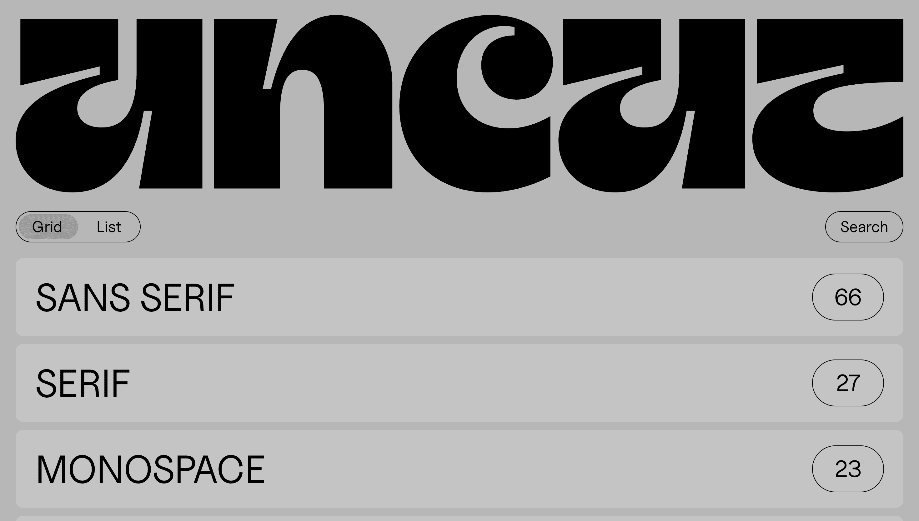
Concept
Pangram Pangram wants buying a typeface to feel as crafted as drawing one. The site therefore reads like an interactive specimen book: every scroll swaps paper grain for pixels, letting designers test-drive family styles before they reach the cart.
Visual Language & Motion
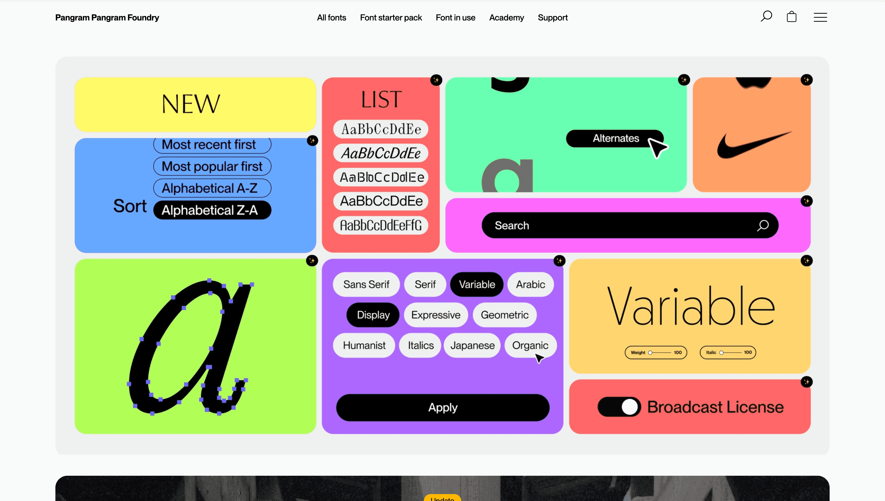
A near-black canvas (#0E0E0E) makes white-ink glyphs glow. The hero floods the viewport with variable-font demos that breathe through weight, width and slant axes as you drag a slider. Section dividers behave like proof-press sheets: GT America captions stamp the top, while specimen text overprints below using CSS blend-modes. GSAP springs slide entire pages horizontally, mimicking a re-centering printing press. Neon accent swatches (lime, magenta, cyan) signal font categories—sans, display, mono—giving the UI a subtle colour-coding system.
UX & Performance
Fonts are streamed via subsetted WOFF2 fallbacks; full variable builds load only when the in-view observer fires, keeping LCP ≈ 1.1 s on desktop and < 1.6 s on 3 G. A sticky side panel offers live glyph peeking and price tiers; keyboard arrows cycle specimens for accessibility, while `prefers-reduced-motion` locks sliders to static frames. Stripe Checkout pops in a modal, so users never leave the page context.
Takeaway
Pangram Pangram proves an e-commerce site can double as a learning tool: by making the act of browsing itself a typographic playground, the brand elevates utility into inspiration and sets a new bar for digital foundries.