Visit website
Motto
13 views4mo ago
Concept
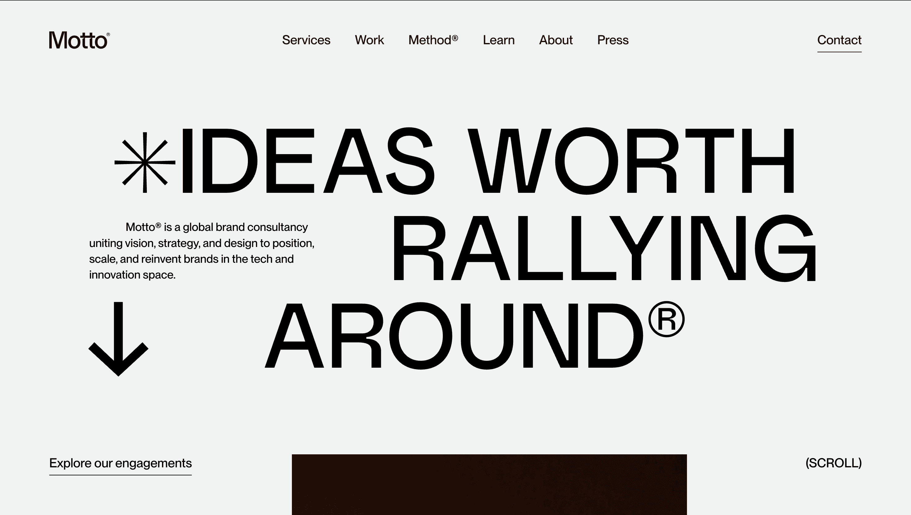
Motto® calls itself “the strategic heart for audacious brands.” The site unfolds like a guided workshop: Define the Brave Idea → Shape the Brand World → Activate at Scale. Prospects move from intrigue to insight to inquiry without slogging through agency jargon.
Visual Language & Motion
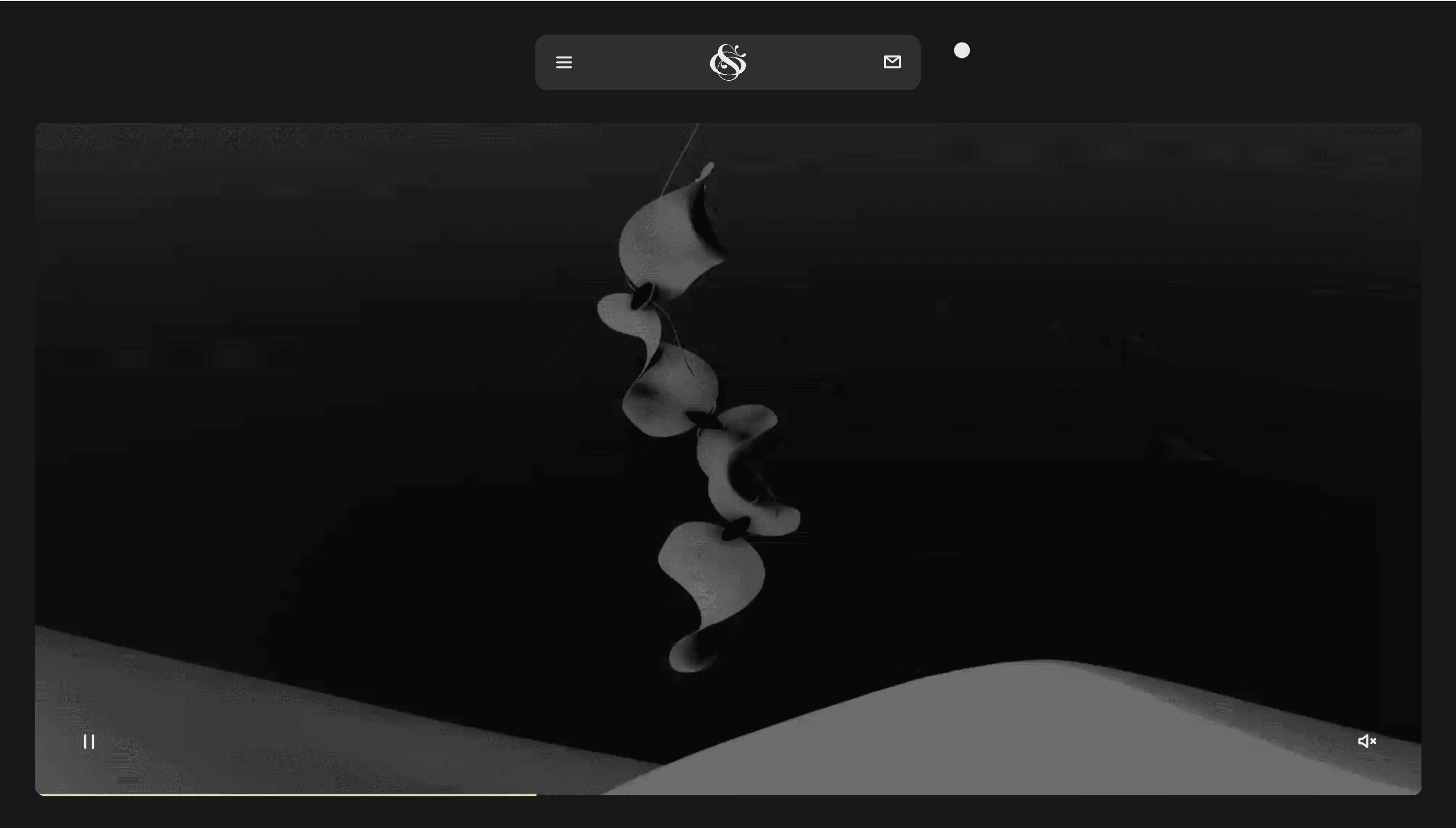
A porcelain-white stage lets colour lead the conversation. XXL Neue Montreal headings march across a 12-column grid, while supporting copy sits in GT America a pairing that feels equal parts editorial and tech-forward. Case-study cards burst with a single accent hue from the client palette, reinforcing the mantra “Use colour with courage.” Hover an image and a paper-tear mask reveals backstage process sketches, underscoring transparency. Subtle GSAP springs slide entire sections upward like flip-chart pages, echoing the agency’s workshop DNA.
UX & Performance
Hero GIF loops are replaced by AVIF stills on mobile, keeping LCP ≈ 1.1 s desktop / 1.5 s on 4 G. IntersectionObserver preloads the next case video two screens ahead, preventing stutter. prefers-reduced-motion swaps section slides for fade-ups and freezes parallax hero text. Colour contrast hits WCAG AA; keyboard focus rings are brand pink for instant visibility. A sticky “Start a Brave Project” button shadow-follows the scroll, collapsing to a thumb-friendly pill under 480 px.
Takeaway
Motto® proves an agency site can be a mini-masterclass in its own philosophy: disciplined grid, fearless colour and no nonsense copy turn the browsing journey into a live demo of what “brave branding” feels like making the next click (Book a Call) almost inevitable.
More Projects

Sponsor
Your ad here