Visit website
Vercel
44 views4mo ago
Concept
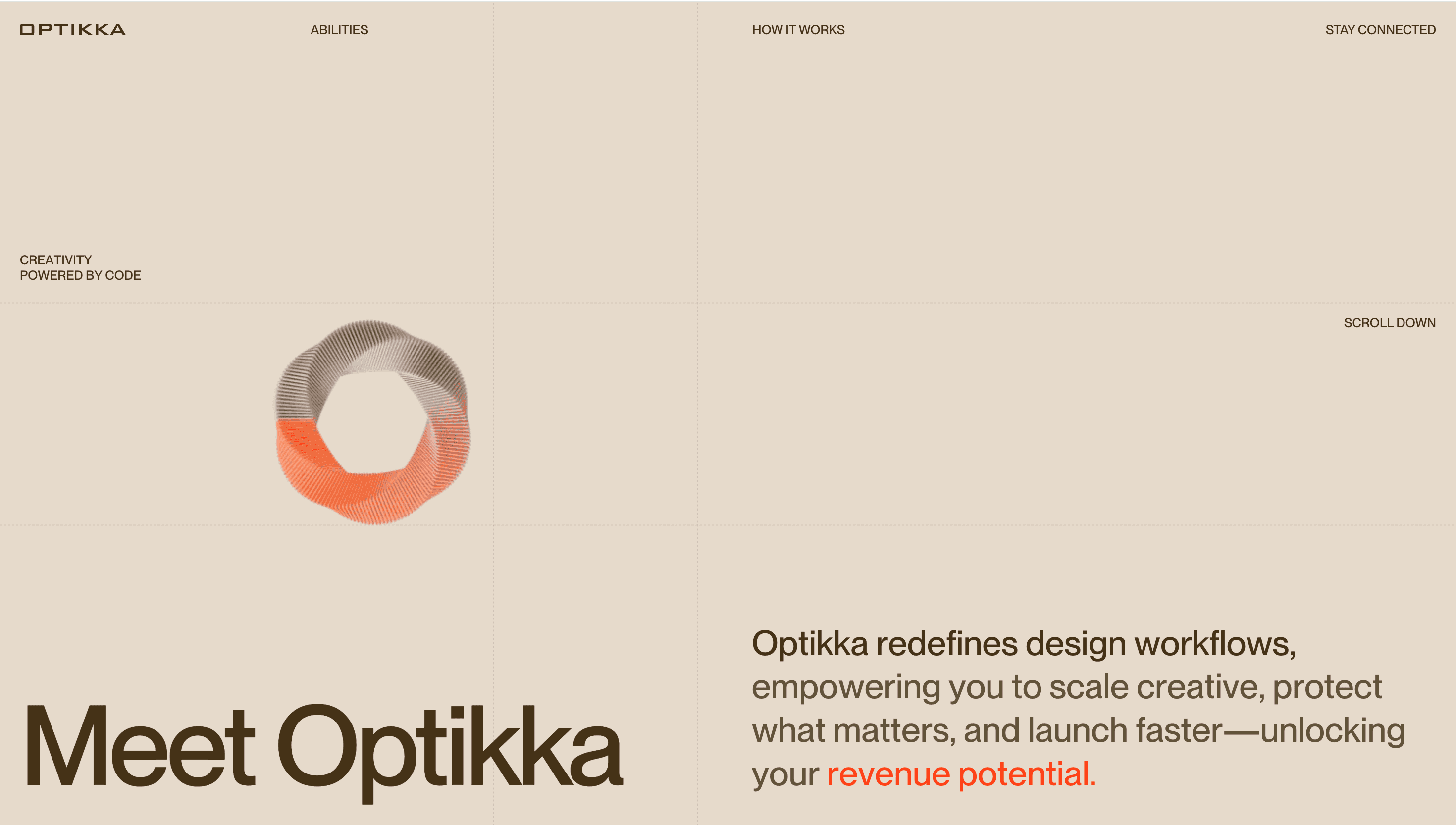
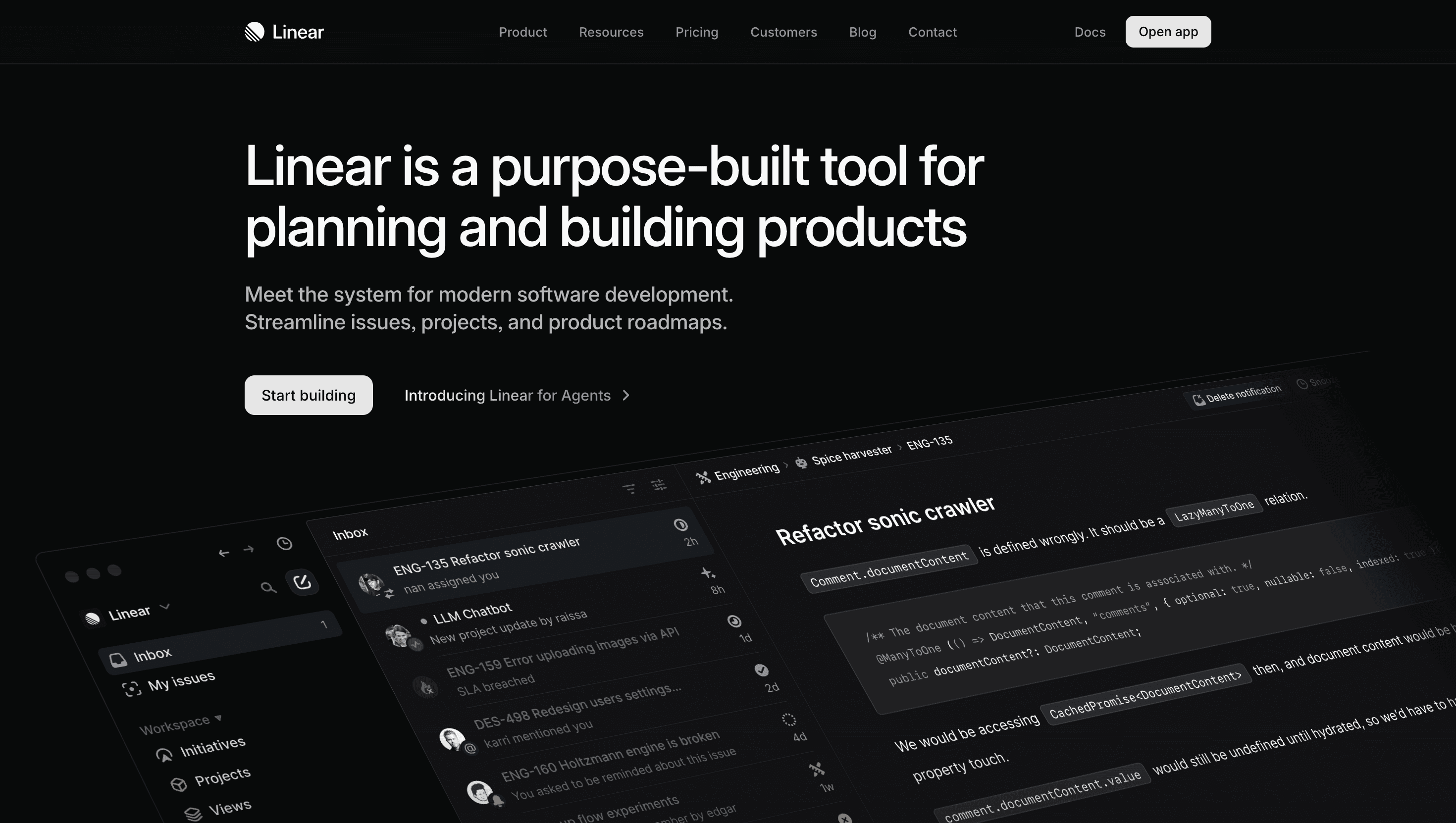
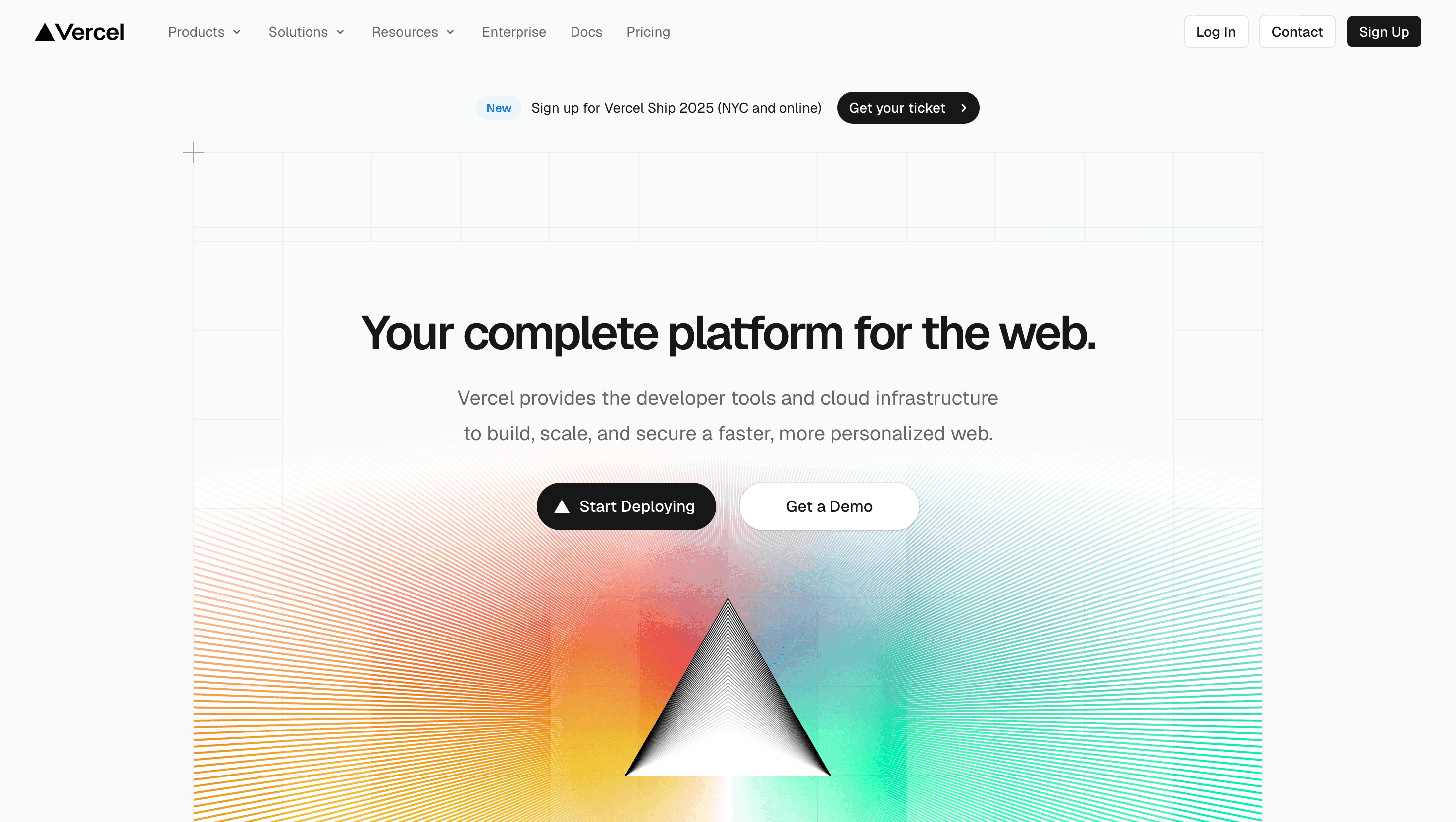
Vercel’s home page is a product demo in disguise: every scroll moves you through the workflow Develop → Preview → Ship → Scale echoing the three-word mantra stamped on its logo lock-up. The story reframes static hosting as a real-time, team-centric loop where each git push spins up a live URL, feedback happens in context and edge functions deploy worldwide in seconds.
Visual Language & Motion
A graphite canvas lets the platform’s trademark infra-blue gradient breathe across hero copy, while Neue Montreal headlines stride across a 12-column grid. Device mock-ups float on subtle z-parallax; hover and they tilt 2° as terminal logs animate, proving zero-config deploys. Accent indigo glows on CTAs and nav focus states restrained, yet unmistakably “Vercel.” GSAP micro motions cards snapping into place, node graphs pulsing once evoke the product’s immediacy without stealing focus.
UX & Performance
Hero AVIF (< 320 KB) lazy-loads after Largest Paint, keeping LCP ~1.1 s on desktop and 1.5 s on 4G. IntersectionObserver defers autoplay code recordings until 50 % viewport, preventing CPU spikes. prefers-reduced-motion locks gradient shimmer and swaps parallax for fades; colour pairs beat WCAG AA even on jet black. A sticky “Start Deploy” pill shadows the scroll, shortening the sign-up funnel to two clicks.
Takeaway
Vercel shows that developer tooling can feel as polished as consumer apps: glitch-free performance budgets, disciplined dark UI and narrative pacing turn edge hosting into an experience that inspires confidence and curiosity to ship the next commit.