Visit website
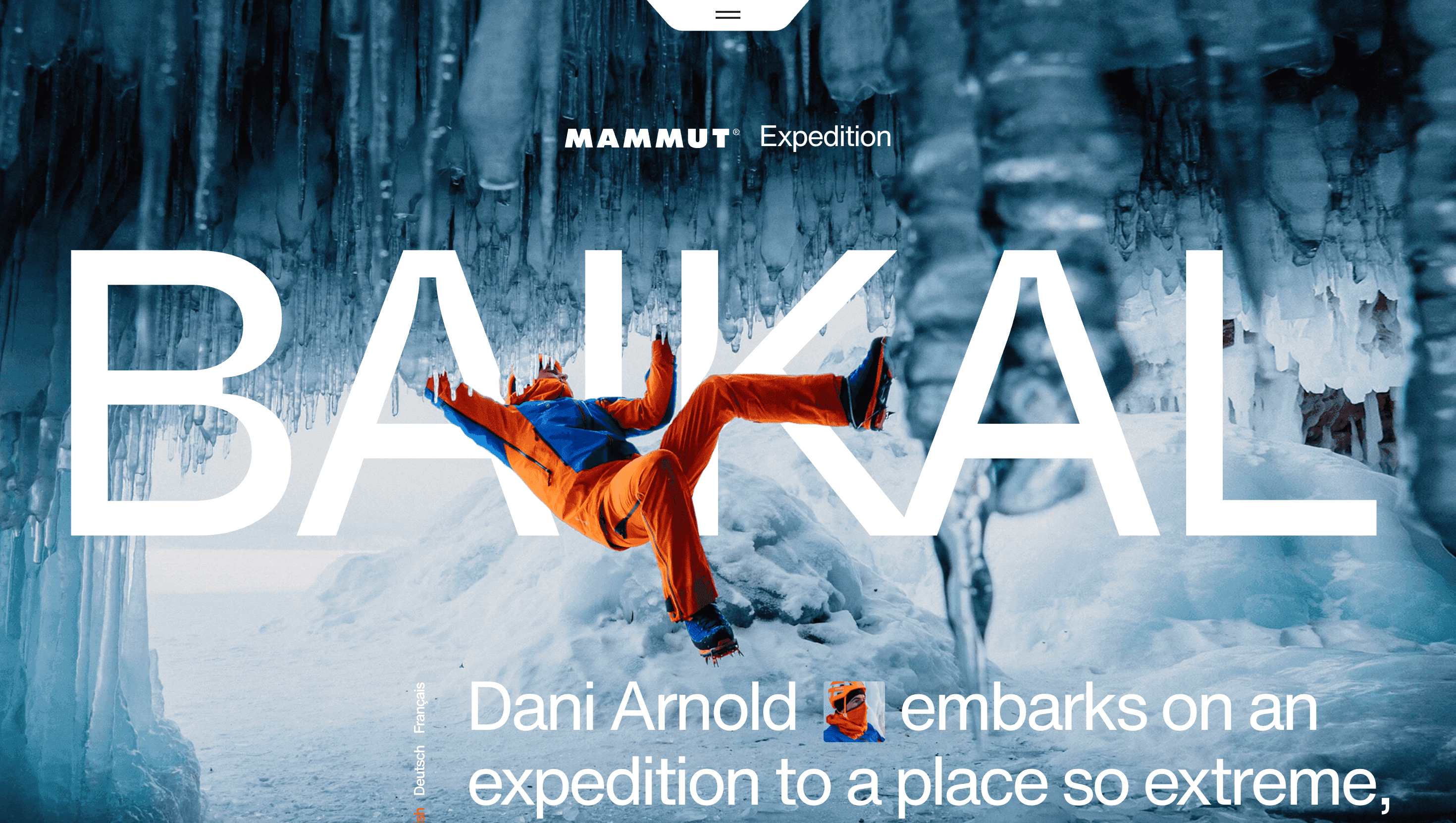
Mammut Expedition Baikal
20 views4mo ago
Concept
Mammut reframes a products-and-price page as a mini-expedition: you trek the North Face of the Eiger while the brand’s flagship apparel reveals itself in situ.
Each swipe feels like kicking crampons into snow—the copy tells you the story of the climb; the visuals show how the kit keeps you alive.
Visual Language & Motion
Hero imagery is cinematic 8K panoramas of glowing dawn over rock flutes.
Scroll triggers parallax ice layers that slide at different speeds, creating depth without WebGL weight.
Gear call-outs pop as glowing “way-points”; click one and a sticky card animates up, showing weight, waterproof rating and a single-tap “Add to pack”.
Colour palette mirrors the collection: lava-orange accents against midnight blues, matching jacket zips and ski-skin trims.
GT America headings punch through the viewport like summit ridgelines; body copy sets in a restrained grotesque, maximising legibility over busy photos.
UX & Performance
AVL-encoded hero video autoplays only on ≥ 1024 px screens; mobiles receive a still JPEG, keeping LCP ≈ 1.2 s on 4 G.
IntersectionObserver prefetches the next panorama seconds before it scrolls into view, so images feel instant yet memory stays lean.
`prefers-reduced-motion` folds parallax into static layers and disables zoom-on-hover, ensuring vestibular comfort.
CTAs anchor to a fixed bottom bar that turns into a checkout drawer—no jarring redirect, shoppers stay immersed.
Takeaway
“Eiger Extreme” shows how a technical gear brand can sell with narrative, not catalogues: place the user on the mountain, let them feel the altitude, then let one click complete the kit.