Visit website
Superpower
10 views4mo ago
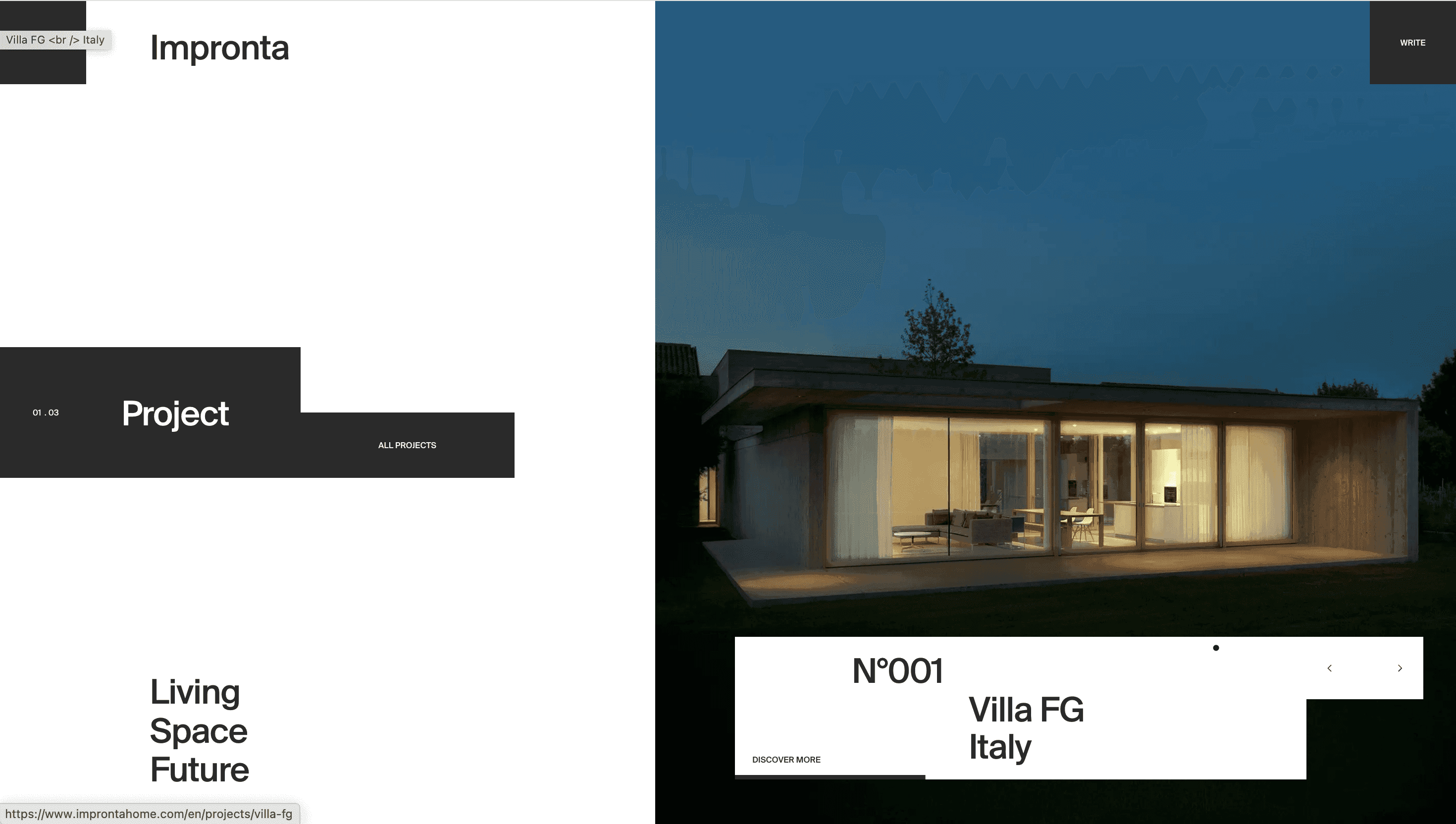
Concept
Superpower sells the idea that peak health is a data project you can actually finish. The site reframes an annual physical as a continuous feedback loop: test 100 + biomarkers, visualise trends, text a private medical team and iterate on diet, lifestyle and supplements.
Visual Language & Motion
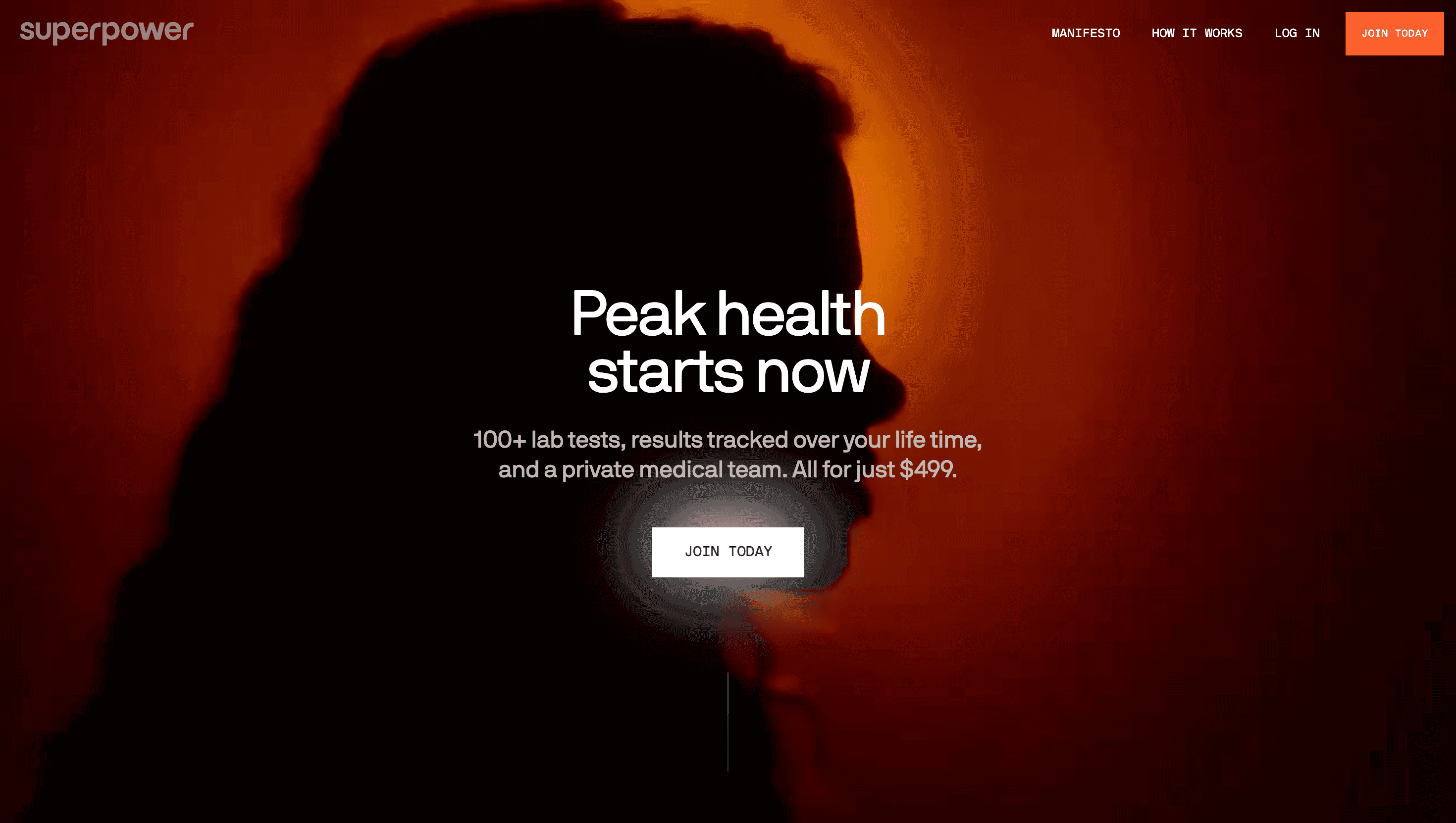
A sterile white canvas evokes a lab bench, while ember-orange accents signal urgency against calm blues and greys. Hero copy lands in bold Right Grotesk caps, followed by an animated ticker that scrolls through “Aging”, “Heart”, “Hormones”—each word parrots the rotating carousel of 3-D pill bottles and blood vials. Parallax panels reveal epigenetic clocks and biological-age cards sliding in like diagnostic read-outs; micro-motions (glowing dots, pulsing rings) mimic ECG blips, turning raw data into living graphics.
UX & Performance
Despite a quilt of high-res charts, LCP hovers near 1.3 s on desktop thanks to AVIF hero images, IntersectionObserver prefetch and eager font loading. Sticky CTA buttons shadow the scroll, but transform into a single “Join Today” bar on mobile to reduce choice paralysis. prefers-reduced-motion swaps parallax for cross-fade stills, maintaining clarity for motion-sensitive users. Colour contrast passes WCAG AA; screen-reader labels on every stat ensure the quantified self is also the accessible self.
Takeaway
Superpower proves that medical UX can feel aspirational, not clinical: by merging minimalist design, data-rich storytelling and rigorous performance budgets, the site turns preventive healthcare into a lifestyle upgrade—one click, one blood draw, one longevity protocol at a time.