Visit website
Jorgobé
17 views3mo ago
Concept
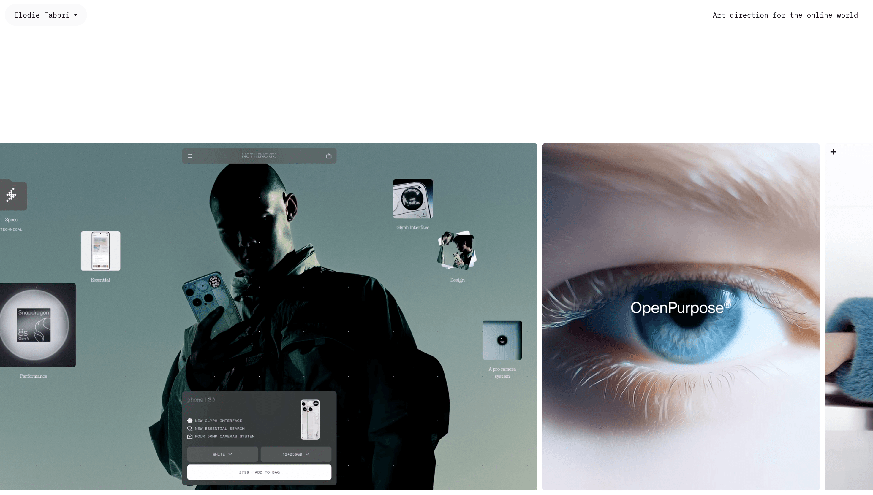
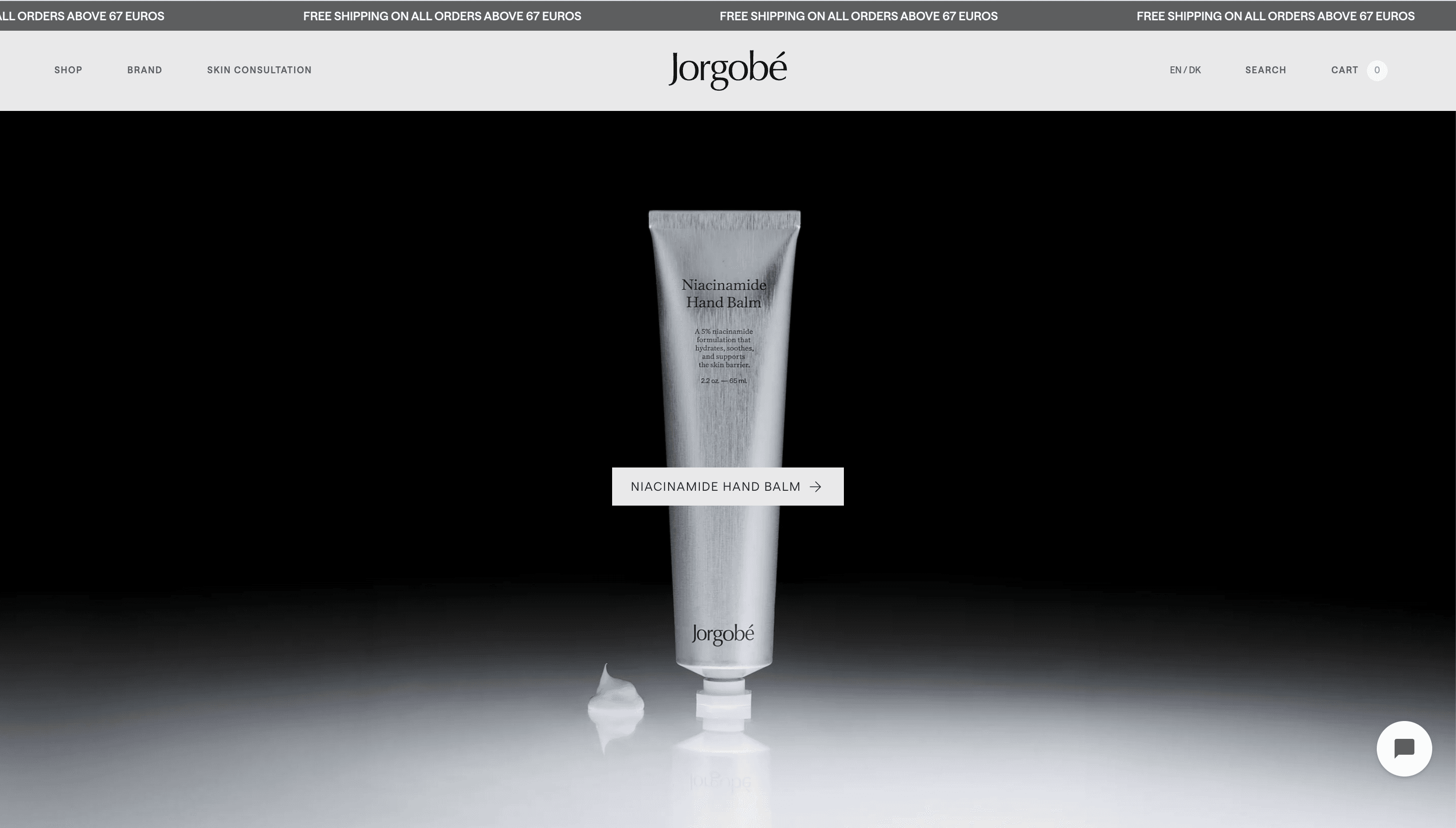
The site centers on a single, clear product promise: a precision regimen of three daily essentials and one weekly booster. This concise positioning drives the content strategy and reduces friction for visitors, keeping the offering easy to understand. The messaging favors restraint over variety, reinforcing a no-nonsense skincare philosophy.
Visual Language & Motion
The brand language implied by the copy leans toward minimal, precise visuals and strong typographic hierarchy to reflect the regimen’s simplicity. Imagery and layout are likely product-forward and uncluttered, reinforcing the notion of essentials only. If motion is present, it would be expected to be subtle and functional, used to guide attention rather than distract.
UX & Performance
The content suggests a streamlined user journey that prioritizes clarity around the regimen: who it’s for, what to use, and when. Calls-to-action and purchase paths are likely straightforward to match the brand’s reductionist promise. This focus on simplicity can support fast load times and an efficient shopping experience.
Takeaway
Jorgobé’s site communicates a tight, focused brand idea: skincare pared down to what matters. Its strength lies in clarity and restraint, making the product regimen easy to grasp and act on. The design and UX choices implied by the messaging should reinforce that efficient, no-frills approach.