Visit website
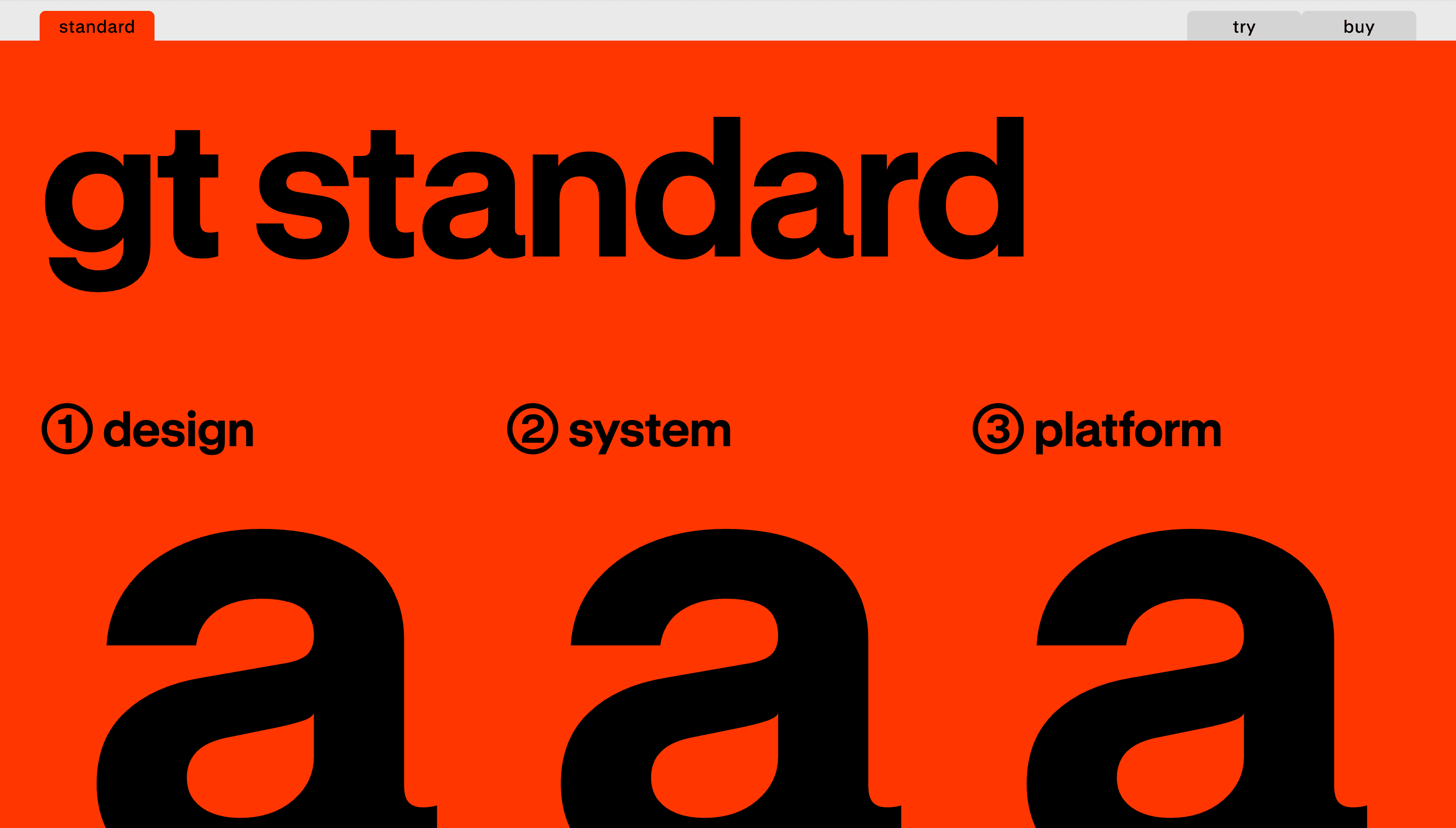
GT Standard
15 views3mo ago
Concept
GT Standard positions itself as a contemporary response to the modernist pursuit of standardization, aiming to reconcile systematic design with expressive typographic detail. The typeface is described as both orderly and personable, prioritizing clarity and adaptability. Its core idea is to offer a consistent typographic voice that remains legible and distinct across uses.
Visual Language & Motion
The visual language pairs measured proportions with restrained, expressive details so letterforms read clearly at small sizes and retain presence at display scales. Rhythm and spacing are emphasized to support predictable hierarchies and comfortable reading. The overall aesthetic favors a neutral, modern tone that can be tuned to different contexts without losing character.
UX & Performance
Framed around clarity and precision, GT Standard is presented for environments that require reliable typographic behavior across mediums. Its systematic approach supports consistent spacing and scalable typographic systems, aiding layout decisions in responsive designs. The focus on adaptability suggests it is intended to perform well across varied applications while maintaining legibility.
Takeaway
GT Standard reads as a modernist-rooted system that balances standardization with expressive nuance, offering designers a dependable, adaptable typographic voice. It’s suited for projects that need a clear, precise typeface that can function across scales and media without sacrificing personality.