Top 10 best dark UI websites in 2026
Refs Editorial · March 26, 2026
The best dark UI websites in 2026 use shadow, contrast, and controlled highlights to feel immersive and premium without making the interface harder to read.
Projects to compare
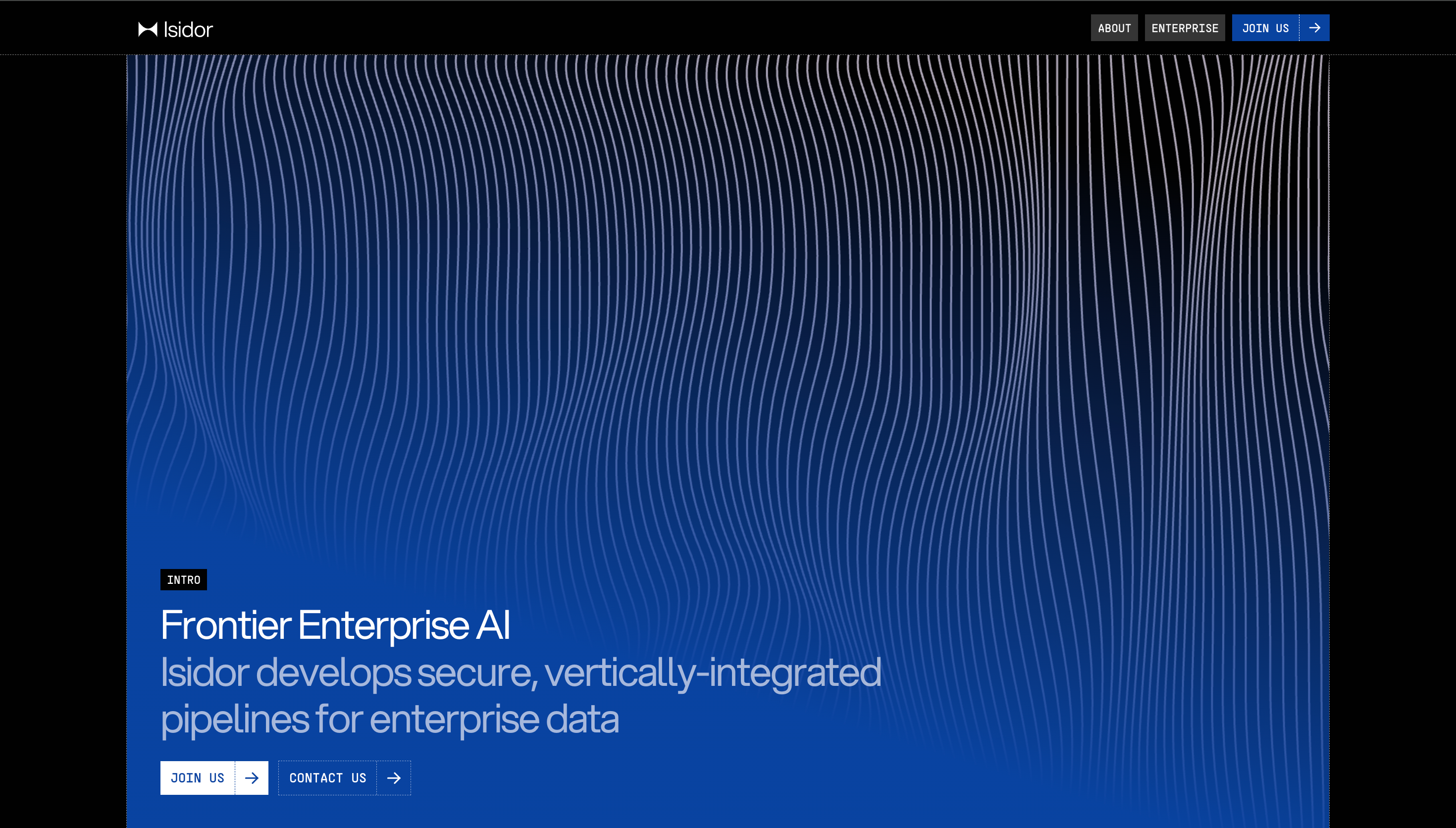
Isidor
Isidor is one of the stronger dark UI references in this set because it combines tech, modern, clean cues with a structure that stays easy to scan. It is especially useful for studying how the site uses depth, contrast, and controlled highlights to create a premium dark interface, not just collecting surface-level visual inspiration.
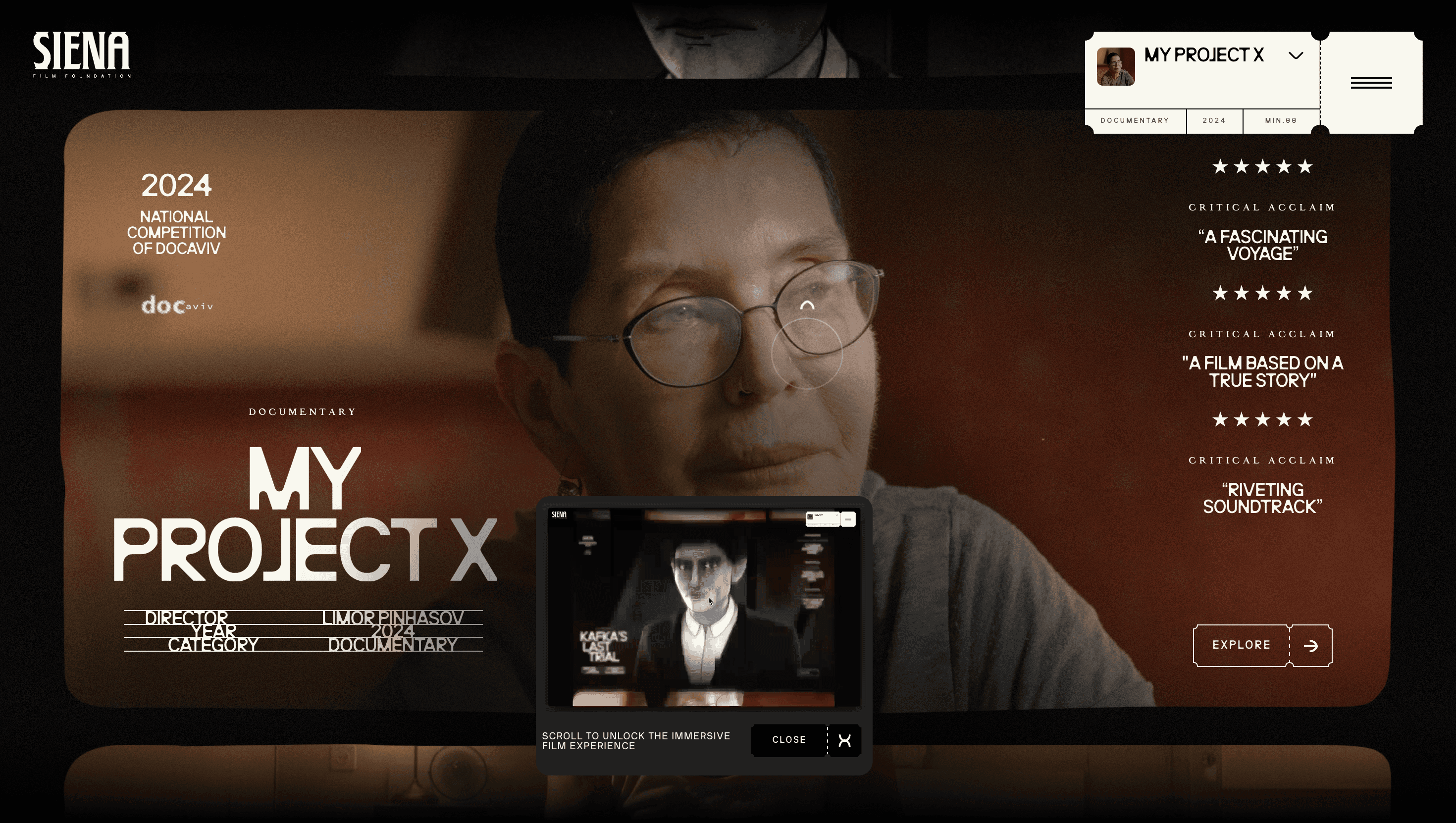
Siena Film Foundation
Siena Film Foundation is one of the stronger dark UI references in this set because it combines storytelling, minimal, motion cues with a structure that stays easy to scan. It is especially useful for studying how the site uses depth, contrast, and controlled highlights to create a premium dark interface, not just collecting surface-level visual inspiration.
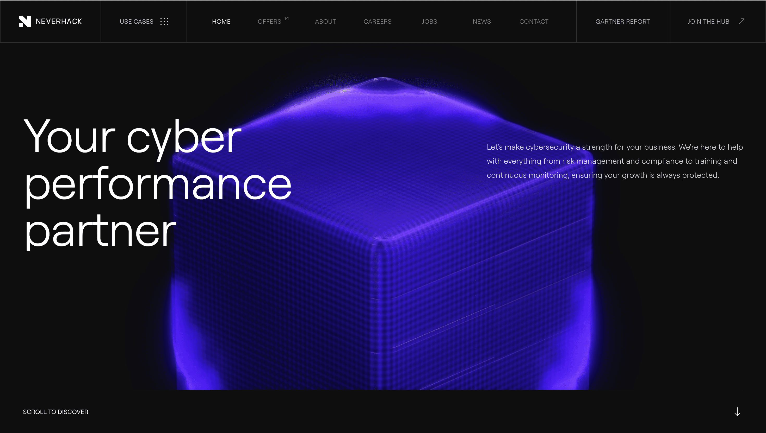
NEVERHACK
NEVERHACK is one of the stronger dark UI references in this set because it combines 3d, motion, minimal cues with a structure that stays easy to scan. It is especially useful for studying how the site uses depth, contrast, and controlled highlights to create a premium dark interface, not just collecting surface-level visual inspiration.
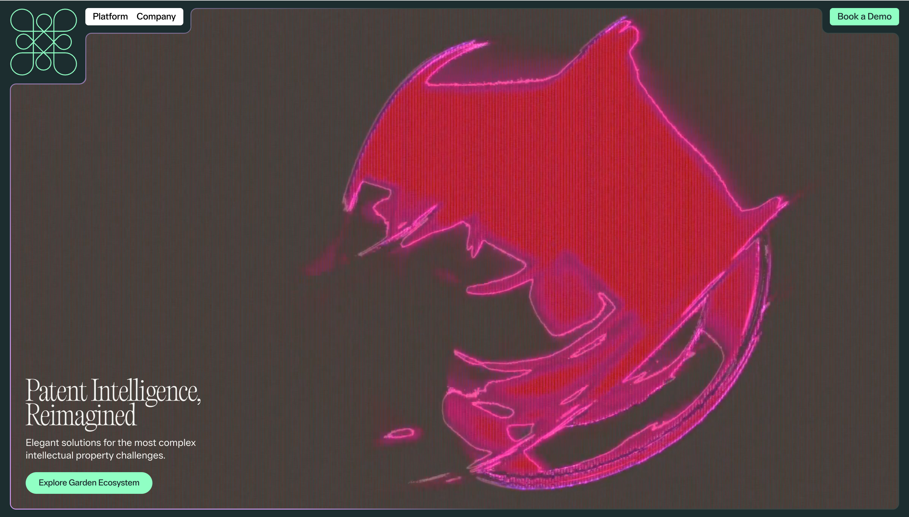
Garden
Garden is one of the stronger dark UI references in this set because it combines corporate, saas, product cues with a structure that stays easy to scan. It is especially useful for studying how the site uses depth, contrast, and controlled highlights to create a premium dark interface, not just collecting surface-level visual inspiration.
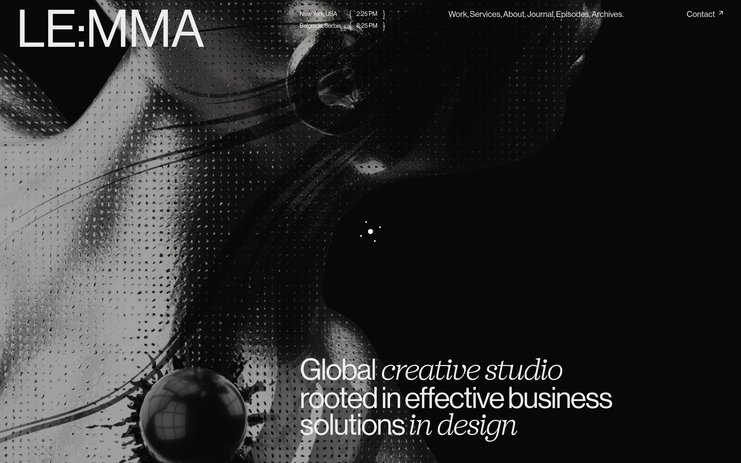
Le:mma Studio
Le:mma Studio is one of the stronger dark UI references in this set because it combines studio, portfolio, motion cues with a structure that stays easy to scan. It is especially useful for studying how the site uses depth, contrast, and controlled highlights to create a premium dark interface, not just collecting surface-level visual inspiration.
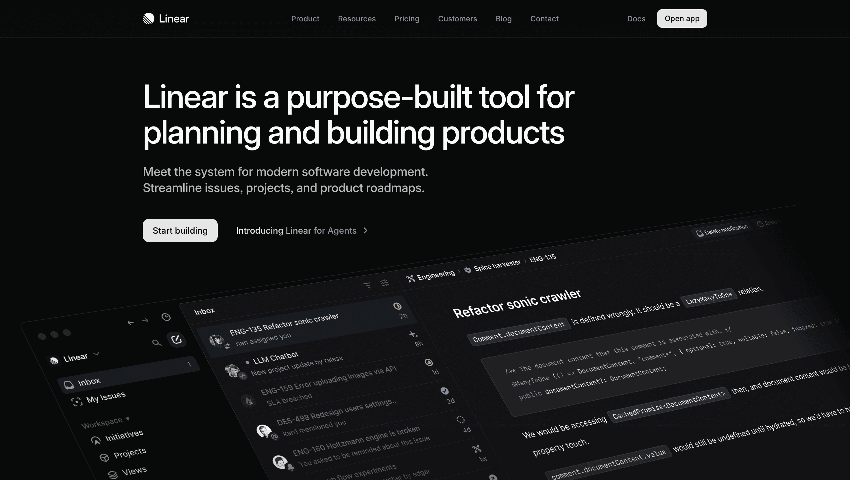
Linear
Linear is one of the stronger dark UI references in this set because it combines saas, productivity, gradient cues with a structure that stays easy to scan. It is especially useful for studying how the site uses depth, contrast, and controlled highlights to create a premium dark interface, not just collecting surface-level visual inspiration.
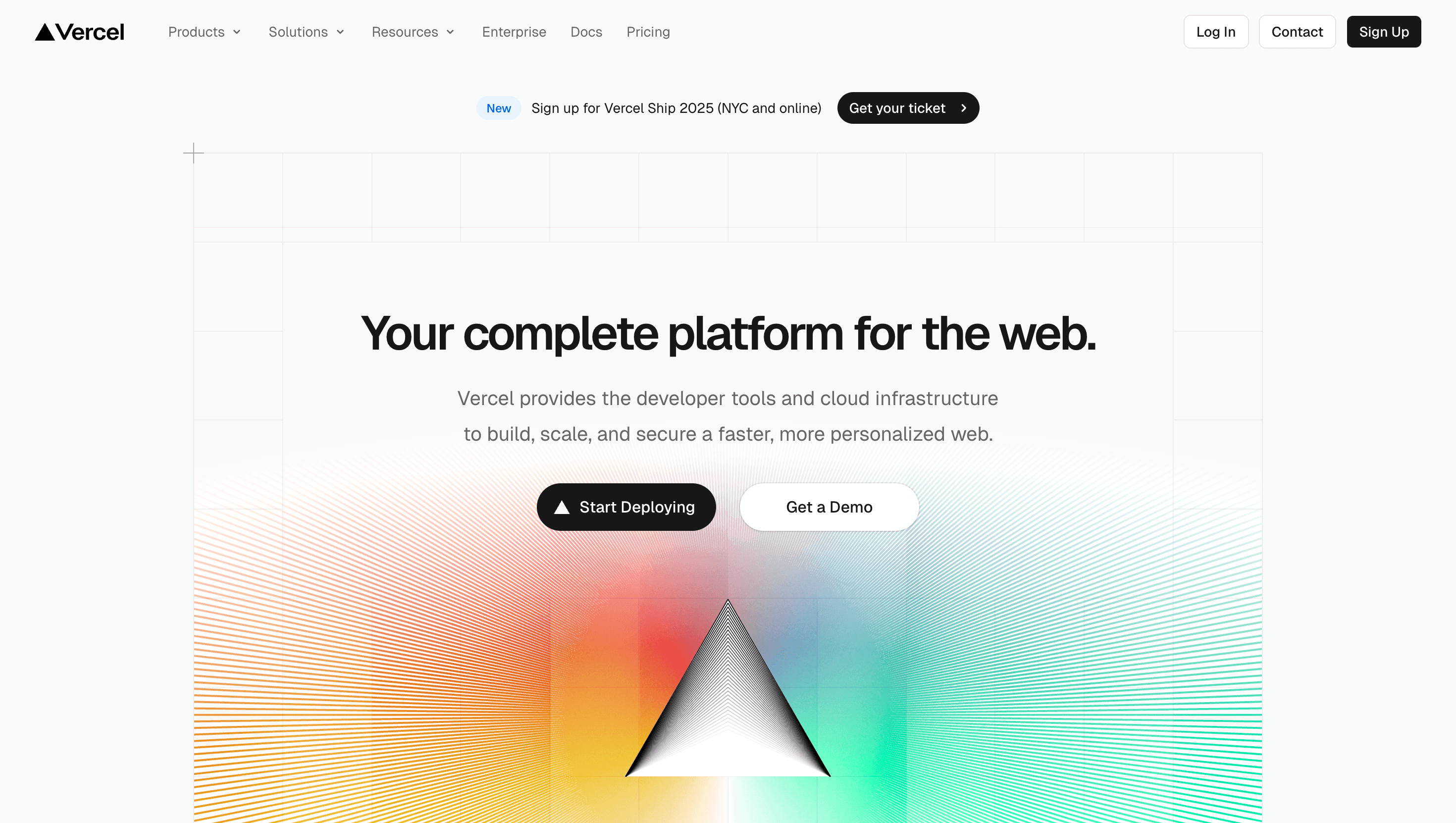
Vercel
Vercel is one of the stronger dark UI references in this set because it combines saas, minimal, dark ui cues with a structure that stays easy to scan. It is especially useful for studying how the site uses depth, contrast, and controlled highlights to create a premium dark interface, not just collecting surface-level visual inspiration.
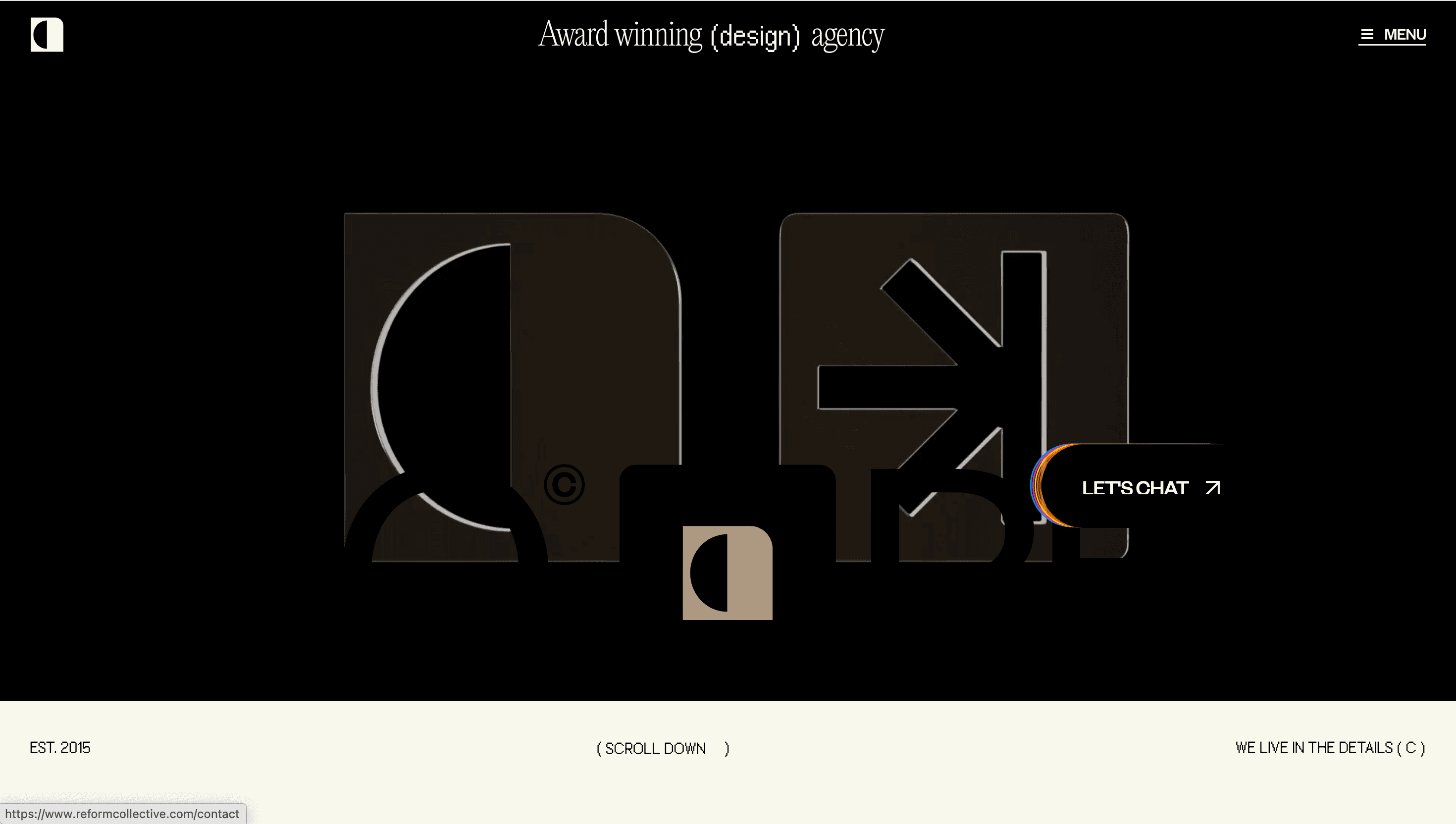
Reform Collective
Reform Collective is one of the stronger dark UI references in this set because it combines agency, minimal, motion cues with a structure that stays easy to scan. It is especially useful for studying how the site uses depth, contrast, and controlled highlights to create a premium dark interface, not just collecting surface-level visual inspiration.
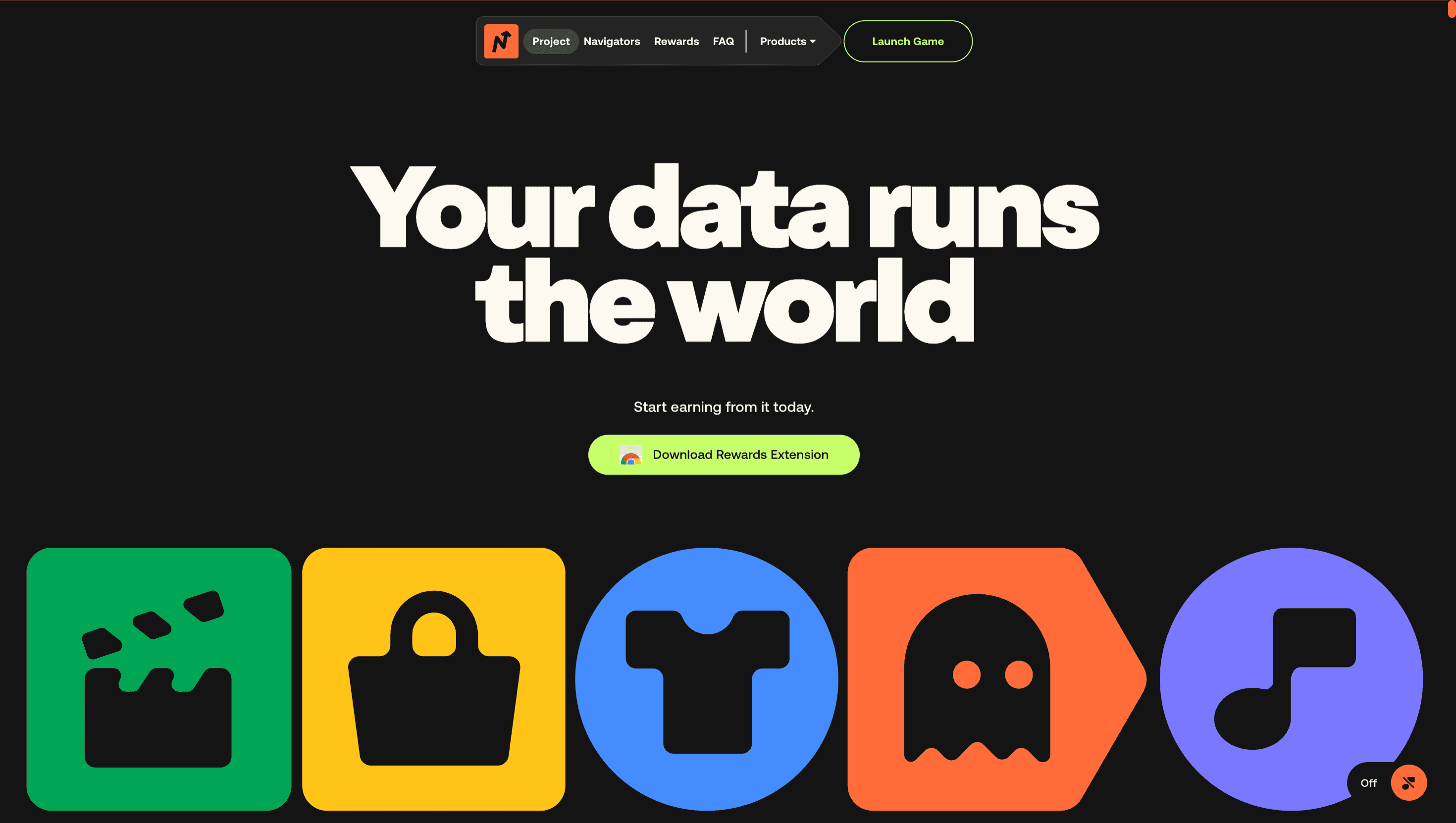
nvg8
nvg8 is one of the stronger dark UI references in this set because it combines motion, dark ui, animation cues with a structure that stays easy to scan. It is especially useful for studying how the site uses depth, contrast, and controlled highlights to create a premium dark interface, not just collecting surface-level visual inspiration.
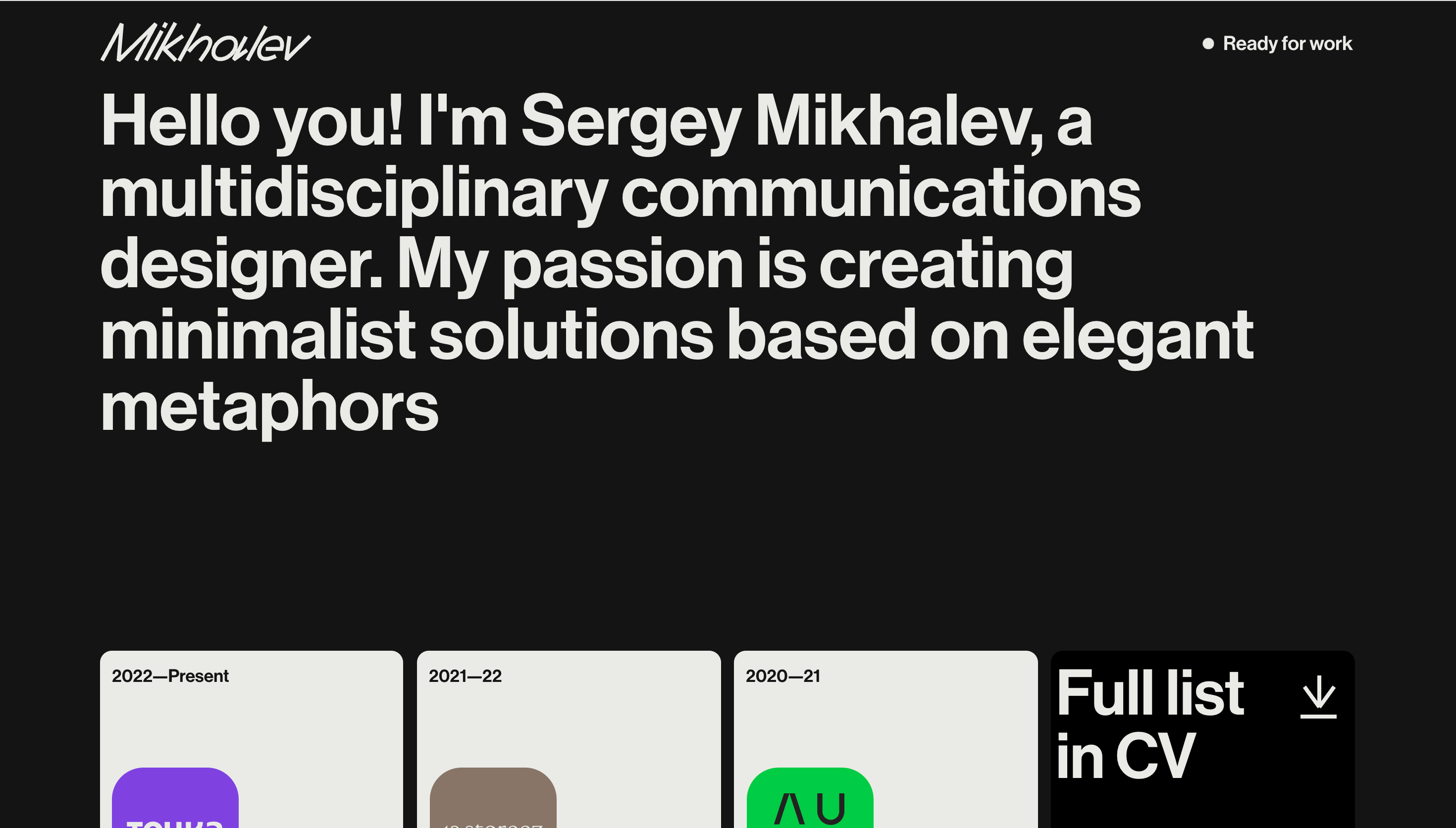
Sergey Mikhalev
Sergey Mikhalev is one of the stronger dark UI references in this set because it combines personal, portfolio, designer cues with a structure that stays easy to scan. It is especially useful for studying how the site uses depth, contrast, and controlled highlights to create a premium dark interface, not just collecting surface-level visual inspiration.
Frequently asked questions
What matters most in a dark UI website?
Contrast discipline matters most. Dark UI works when headings, body text, actions, and media all remain easy to distinguish without relying on harsh or tiring extremes.
Is dark UI always better for premium brands?
Not always. Dark UI can signal premium tone, but only when it supports the brand and preserves readability. In the wrong context it can reduce clarity more than it adds atmosphere.