Visit website
Brewdistrict 24
Published Jan 31, 2026
Concept
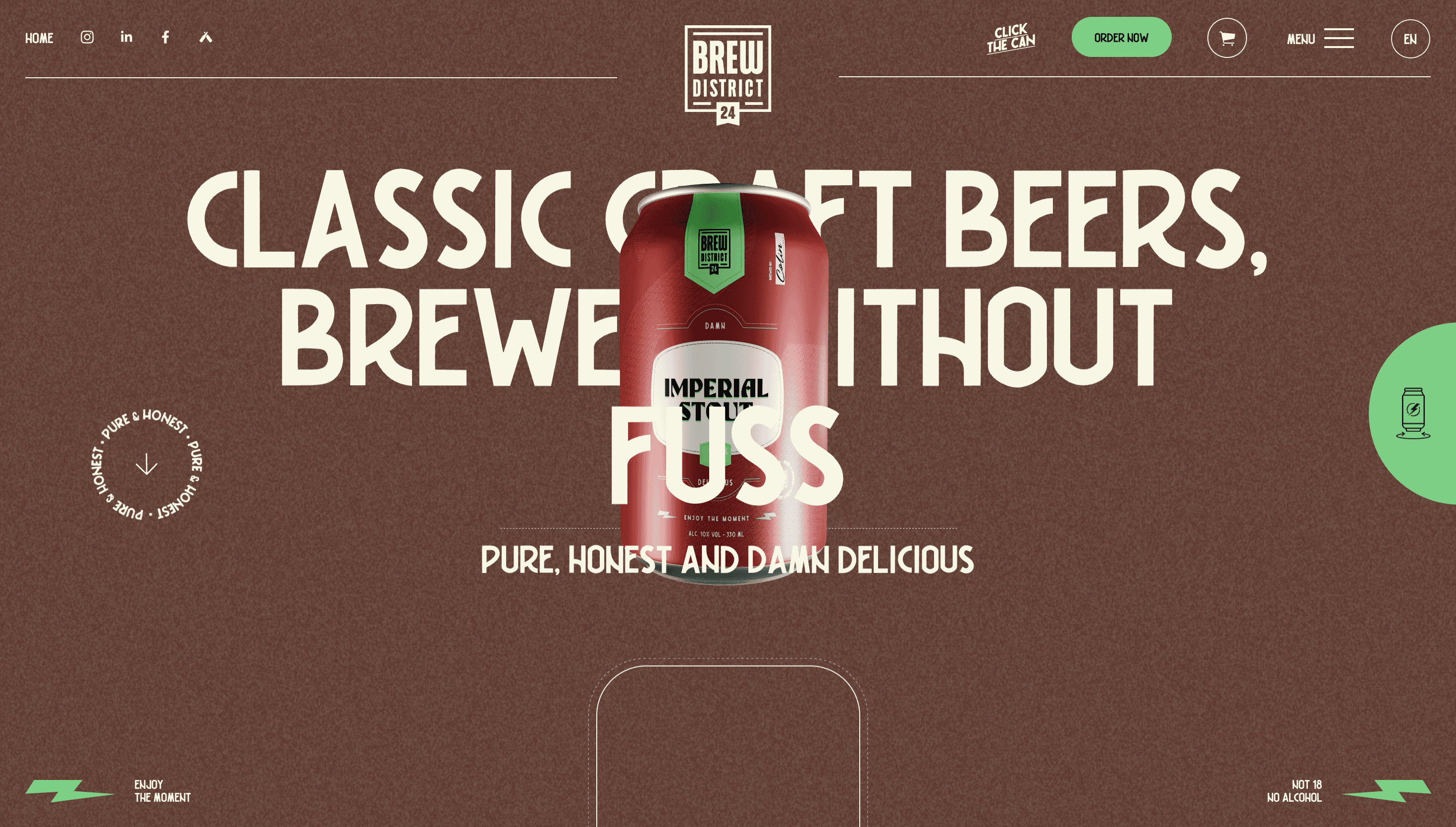
Brewdistrict 24 positions itself as a straightforward craft brewery focused on quality and authenticity. The brand narrative centers around the district concept, emphasizing a community-driven and honest approach to brewing classic beer styles without unnecessary gimmicks. It presents a clear identity that values the craft over marketing fluff.
Visual Language & Motion
The visual identity relies on a bold and grounded aesthetic that reflects the brand's no-nonsense attitude. High-quality product photography is paired with strong typography to create a sense of reliability and tradition. The design avoids over-the-top animations in favor of a clean layout that lets the product and the brewing philosophy take center stage.
UX & Performance
The user experience is designed to be direct and accessible, mirroring the brand's transparent brewing philosophy. Navigation is streamlined to focus on product discovery and brand storytelling, ensuring a seamless flow for users. The interface remains functional and efficient, prioritizing clarity and ease of use for beer enthusiasts.
Takeaway
Brewdistrict 24 successfully translates its honest brewing ethos into a digital presence that feels grounded and authentic. It serves as a strong example of how a food and beverage brand can use a focused message and a clean visual style to build trust with its audience. The site proves that simplicity is often the most effective way to communicate craft quality.