Visit website
Ciao Energy
Published Aug 24, 2026
Concept
Ciao Energy positions itself as a premium alternative in the beverage market, focusing on a brand identity that balances lifestyle and performance. The website serves as a digital manifesto, highlighting the product's unique qualities through a modern and high-impact presentation. It aims to capture the attention of an active demographic by presenting the energy drink as a refined, essential companion for daily life.
Visual Language & Motion
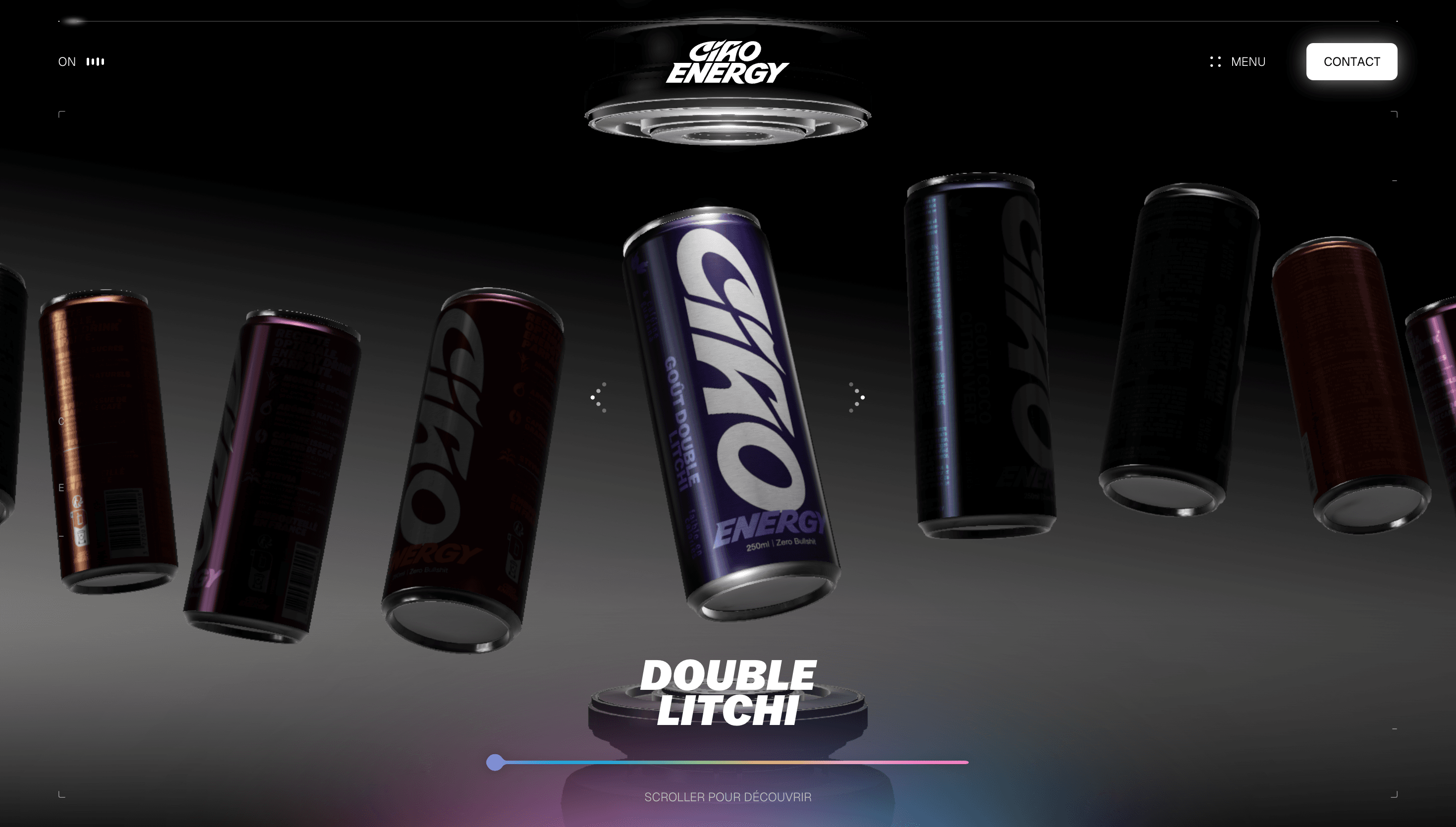
The design is defined by its use of oversized, bold typography and a vibrant color palette that directly references the product's packaging. Smooth scroll-triggered transitions and dynamic motion effects create a sense of constant momentum, reflecting the energetic nature of the brand. High-quality 3D renders and product photography are integrated into the layout to provide a tactile and immersive feel.
UX & Performance
The user interface is streamlined to prioritize visual storytelling, guiding the user through the brand's narrative without the need for complex navigation. Interactive elements respond fluidly to user input, maintaining a high level of engagement while ensuring the site remains performant. The responsive layout ensures that the high-energy aesthetic and smooth animations translate effectively across both mobile and desktop screens.
Takeaway
Ciao Energy is a standout example of how a single-product landing page can use aggressive typography and fluid motion to establish a powerful brand presence. It successfully merges commercial objectives with artistic execution, making the product feel both accessible and aspirational. The site demonstrates the effectiveness of using web animation to enhance product storytelling and brand recall.