Visit website
The Bettering Company
Published Jan 31, 2026
Concept
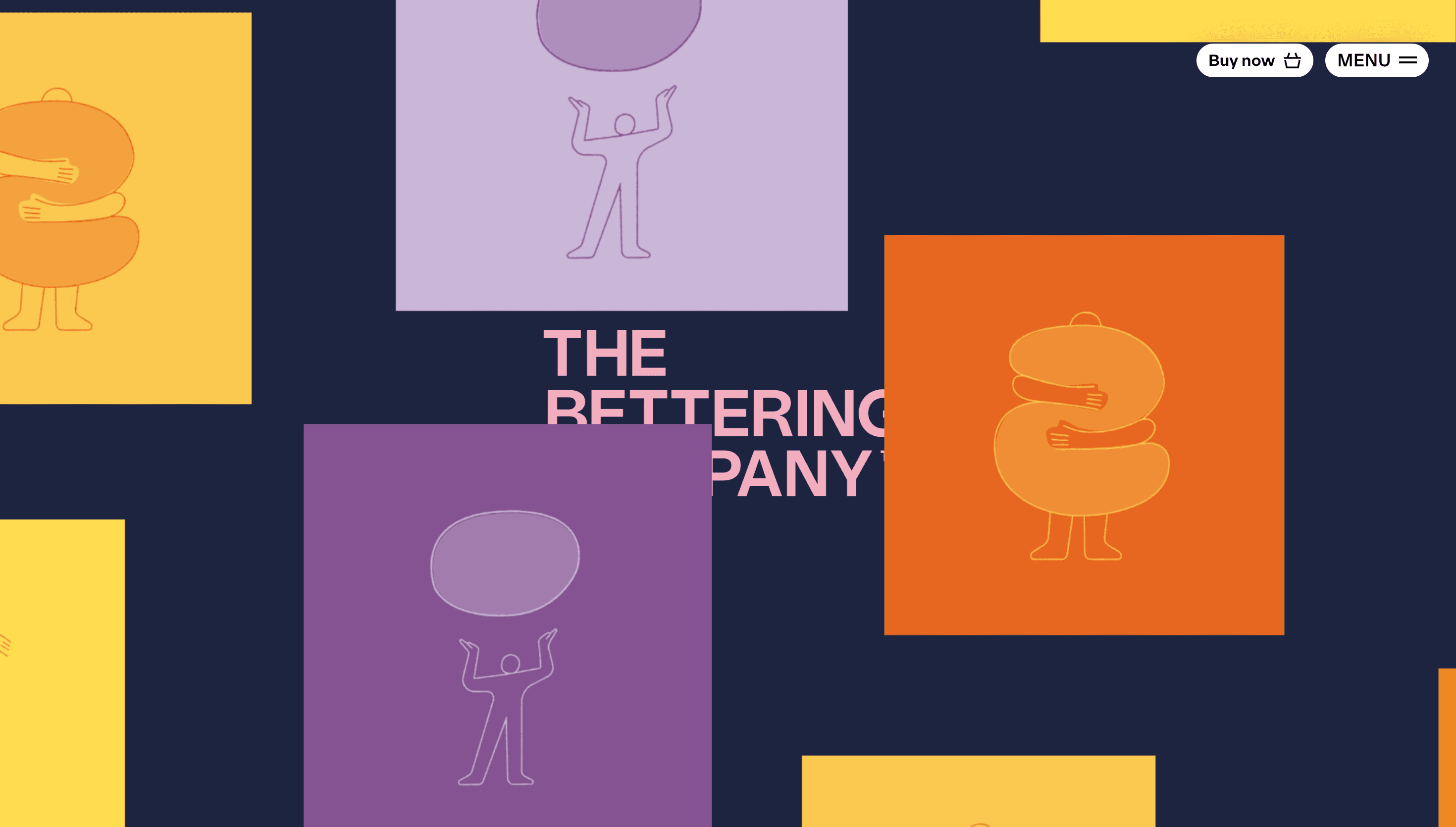
The Bettering Company positions itself as a premium disruptor in the cannabis edibles market. The site serves as a teaser and community-building platform, inviting users to join an exclusive circle for upcoming product releases. It focuses on the idea of improvement and elevation within a specific lifestyle niche.
Visual Language & Motion
The aesthetic is bold and modern, utilizing high-quality typography and a clean layout to convey a sense of luxury and quality. Motion is used to guide the user through the narrative of bettering, likely featuring smooth transitions or scroll-triggered animations that emphasize the brand's premium positioning.
UX & Performance
The user experience is centered around a simple call to action, primarily focused on email capture and brand storytelling. Performance is optimized for high-impact visuals, ensuring that the brand's message is delivered without friction across various devices. The interface remains minimal to keep the focus on the core brand message.
Takeaway
This site is a masterclass in brand-led landing pages, using mystery and high-end design to build anticipation for a product launch. It demonstrates how a focused aesthetic and a clear value proposition can create a strong community connection before a product even hits the market.