Visit website
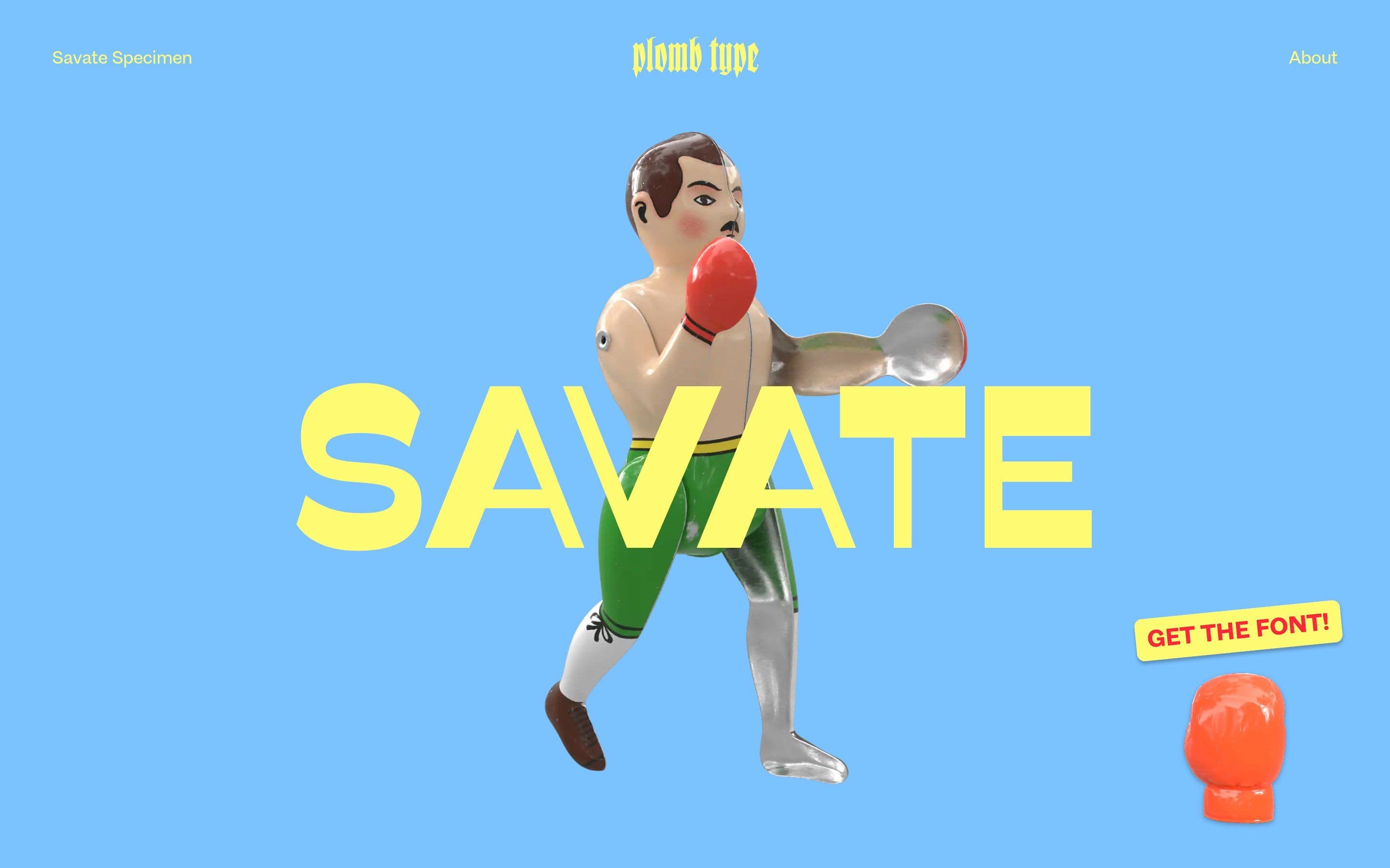
Savate Specimen — Plomb Type
19 views3mo ago
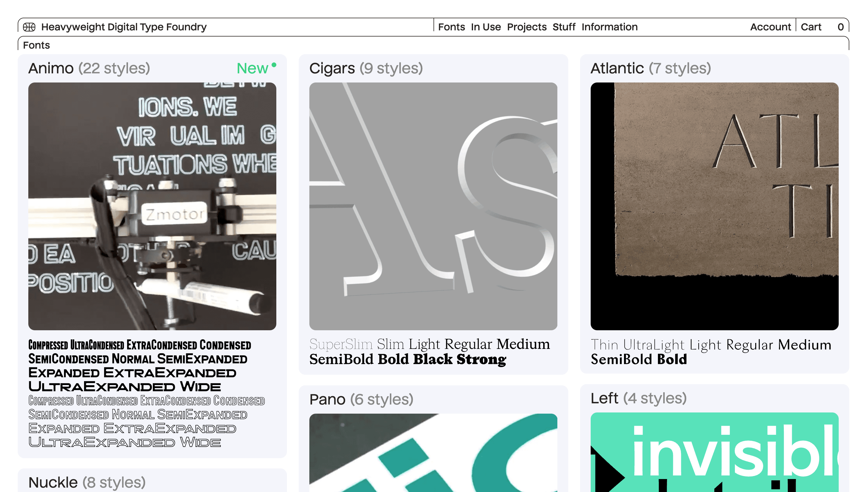
Concept
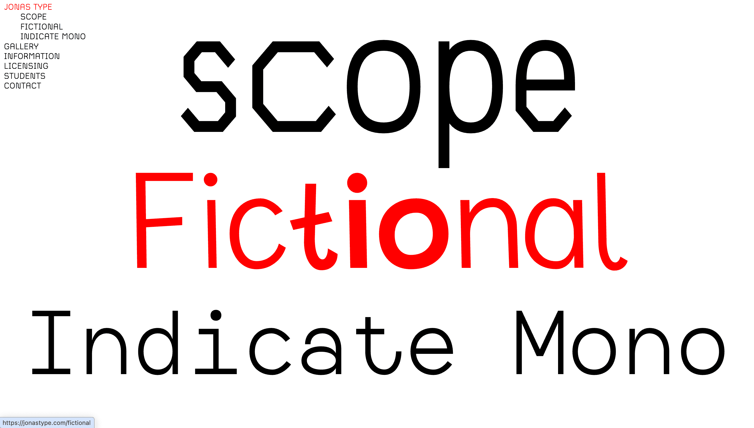
Savate reimagines traditional typography through its distinctive reverse contrast design, where horizontal strokes are thicker than vertical ones. This humanist sans-serif typeface challenges conventional weight distribution while maintaining readability across various applications.
Visual Language & Motion
The typeface features a deliberate inversion of stroke contrast combined with subtle humanist characteristics. Its eight weights—from hairline Extralight to commanding Black—each include precisely angled italics, creating a cohesive yet dynamic typographic system.
UX & Performance
As a functional display face, Savate offers designers extensive weight options for creating clear visual hierarchies. The family's consistency across weights ensures seamless implementation in both digital and print environments.
Takeaway
A bold typographic statement that merges experimental reverse contrast with practical versatility. Savate excels in editorial contexts and branding projects seeking distinctive yet readable typography.
More Projects

Sponsor
Your ad here