Visit website
Dropbox Brand
Published Jan 29, 2026
Concept
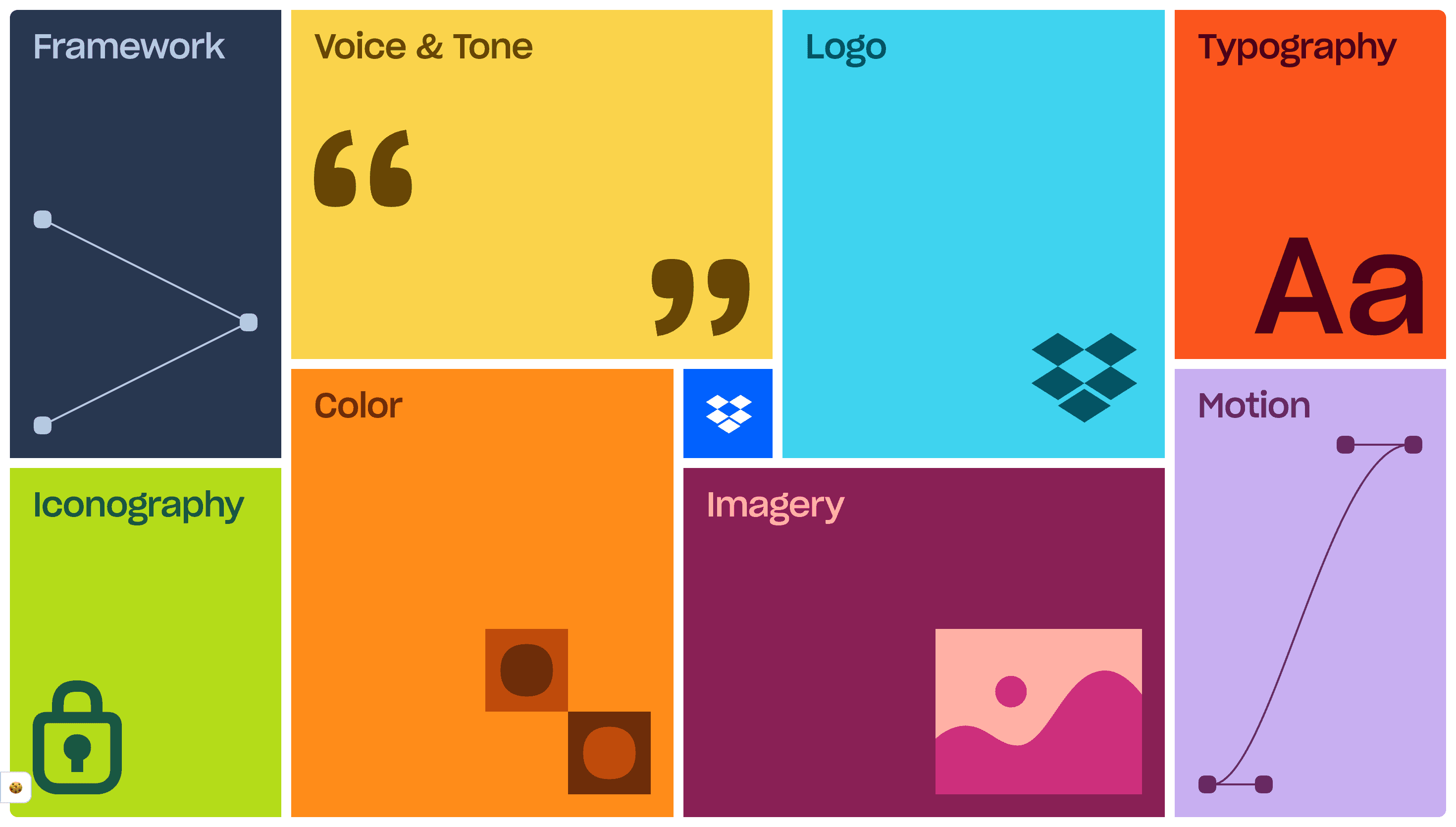
The Dropbox Brand Guidelines site serves as a centralized, interactive repository for the company's evolving visual and verbal identity. It is designed to empower creators and partners by providing clear instructions on how to communicate the brand's core values of organization and creative energy through every touchpoint.
Visual Language & Motion
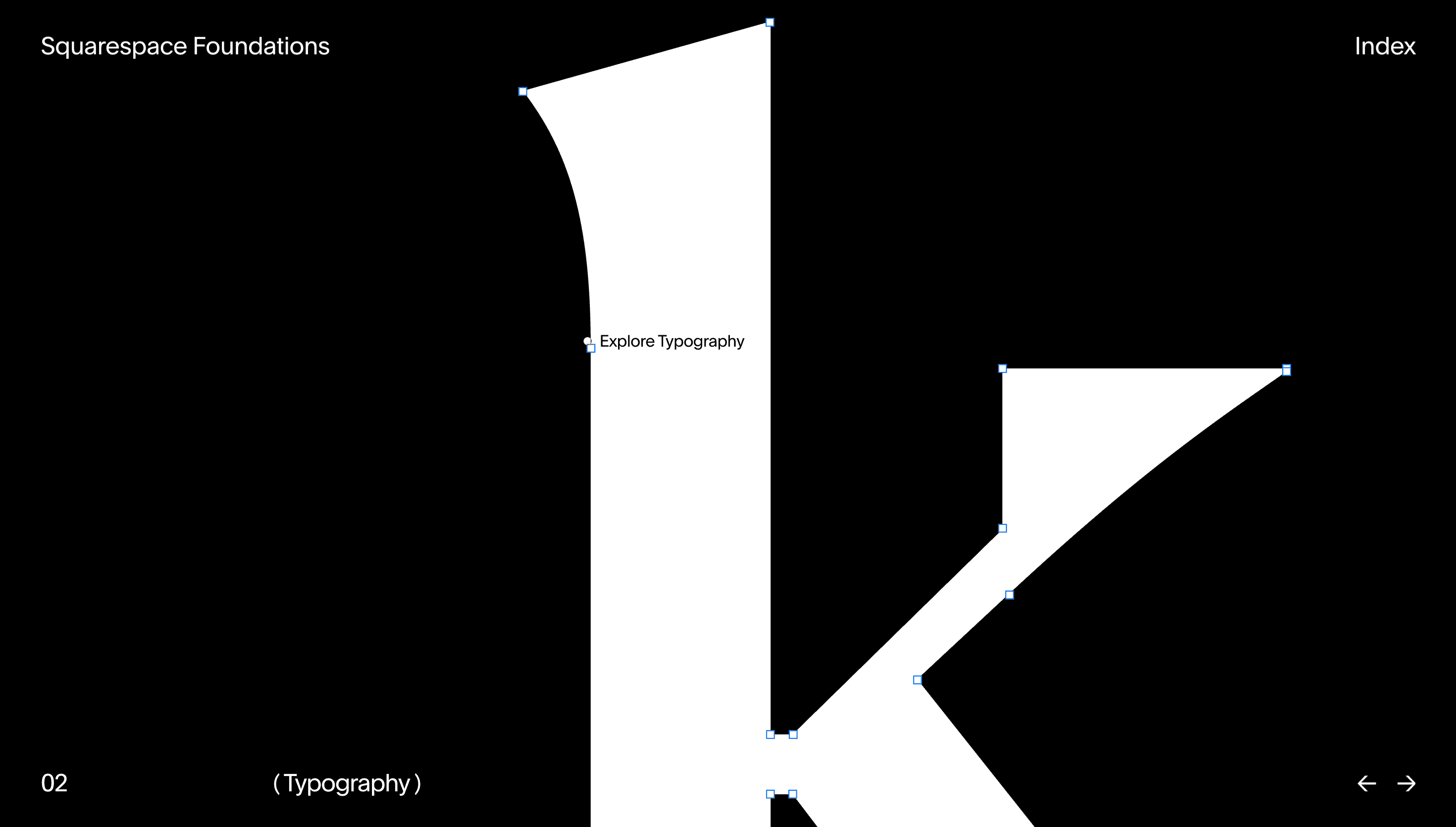
The aesthetic is defined by a sophisticated use of typography, specifically Sharp Grotesk, paired with a vibrant and expansive color system that moves beyond traditional corporate palettes. Motion is treated as a foundational element rather than an afterthought, with specific guidelines that describe how elements should move to reflect the brand's personality and functional clarity.
UX & Performance
The site utilizes a highly structured, modular layout that makes complex design systems easy to navigate and digest. Each section is meticulously organized with high-resolution examples and clear documentation, ensuring that the technical implementation of the brand is as seamless as the design itself.
Takeaway
This site is a premier example of how a global tech company can maintain a cohesive identity while allowing for creative expression across different platforms. It demonstrates that brand guidelines can be both a functional tool for developers and an inspiring showcase of design excellence for the creative community.