Visit website
The Brandt
Published Jan 29, 2026
Concept
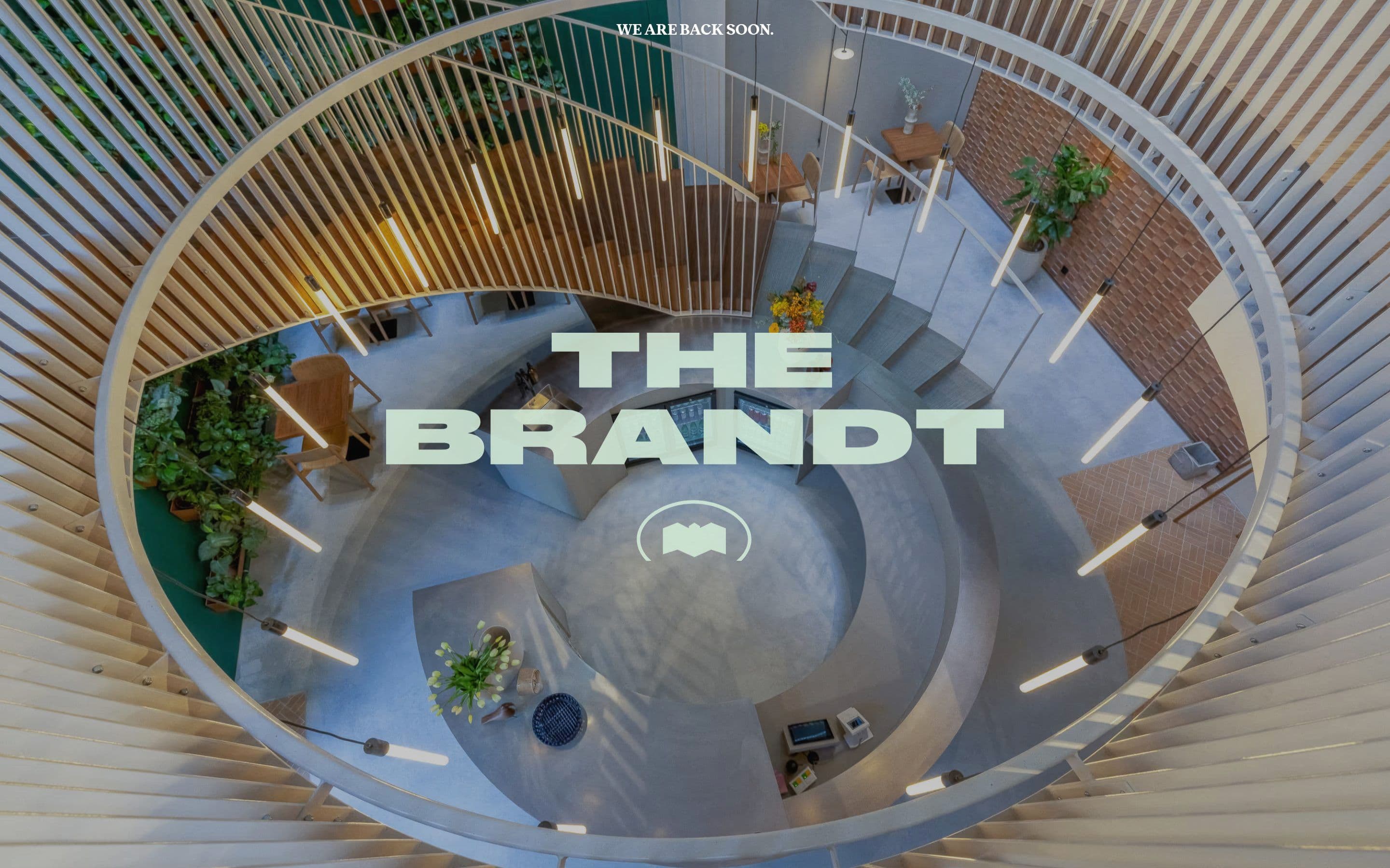
The Brandt presents a minimalist placeholder page that serves as a digital transition for the Amsterdam-based creative entity. It focuses on maintaining a professional brand presence while signaling a forthcoming update or relaunch to its audience.
Visual Language & Motion
The design language is characterized by extreme minimalism, featuring a clean white canvas and sophisticated typography. The layout emphasizes negative space and structural balance, suggesting a brand identity rooted in clarity and modern aesthetics.
UX & Performance
The user experience is intentionally limited to a single-view landing page that delivers its message instantly without distraction. This lightweight approach ensures near-instant load times and perfect responsiveness across mobile and desktop environments.
Takeaway
The Brandt illustrates how a temporary landing page can maintain brand authority through high-quality typographic execution and a restrained visual palette. It is a study in how less can be more when communicating a period of transition.