Visit website
Nothing Intl
Published Jan 29, 2026
Concept
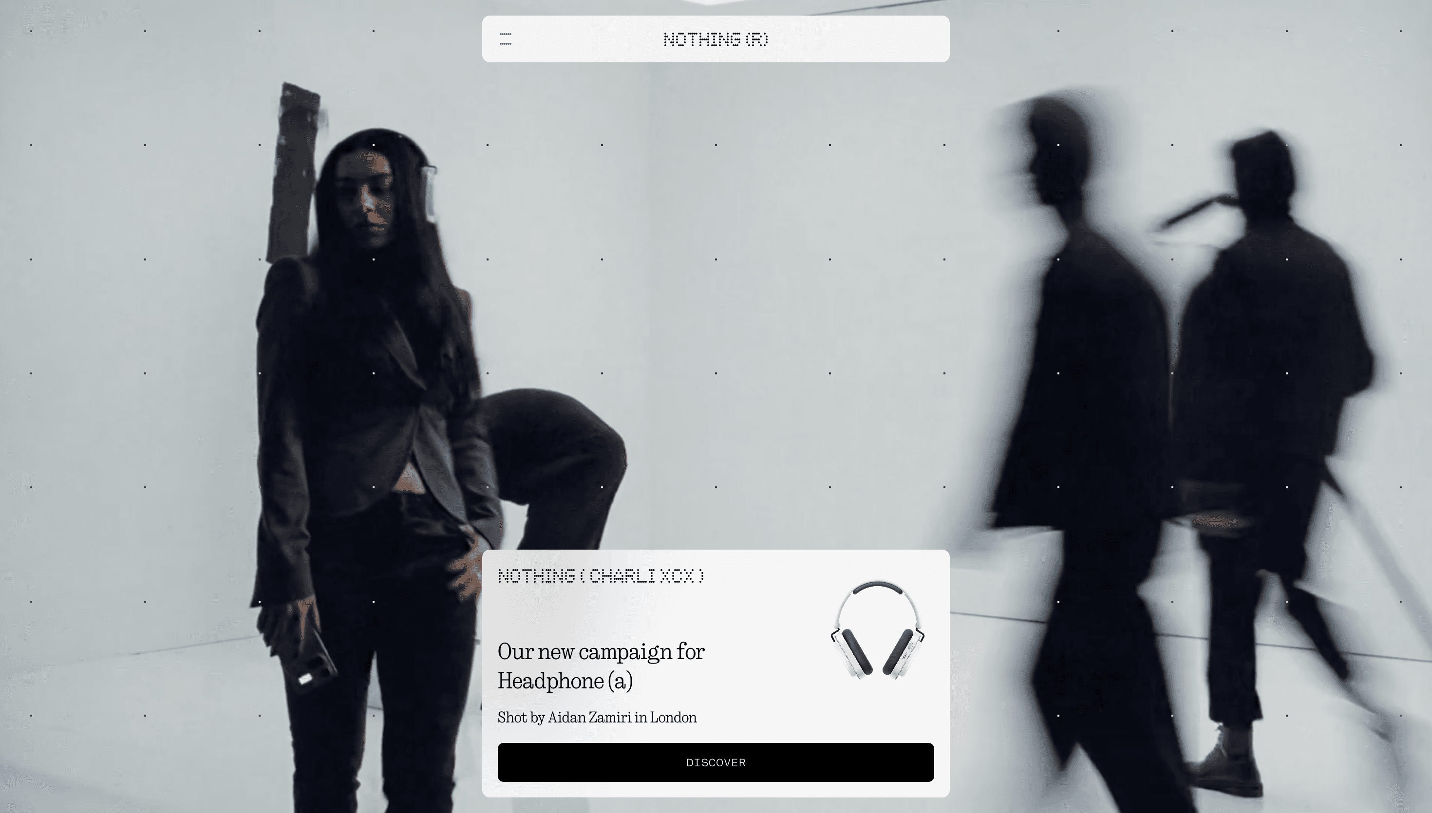
Nothing positions itself as a challenger in the consumer electronics space, aiming to restore a sense of wonder and excitement to personal technology. The website acts as both a high-end digital showroom and a direct-to-consumer e-commerce platform for their ecosystem of transparently designed hardware. It emphasizes a philosophy of removing barriers between people and technology through thoughtful, minimalist innovation.
Visual Language & Motion
The visual identity is defined by a signature dot-matrix typography and a stark, high-contrast color palette that mirrors the physical design of their products. Immersive product photography and 3D renders are integrated with smooth, scroll-driven animations that reveal internal components and features. The interface balances a brutalist structure with refined transitions, creating a cohesive retro-futuristic atmosphere.
UX & Performance
The user experience is designed to be as tactile and engaging as the hardware itself, utilizing interactive elements to guide visitors through product specifications. Navigation is streamlined to prioritize product discovery and storytelling, ensuring that the technical details feel like part of a larger narrative. Performance is optimized to handle high-resolution assets and complex motion sequences without sacrificing the fluidity of the browsing experience.
Takeaway
Nothing demonstrates how a hardware brand can use its digital platform to reinforce a distinct design language and cultural identity. By moving away from generic tech aesthetics, the site creates a memorable brand experience that prioritizes personality and visual consistency. It serves as a benchmark for modern e-commerce sites that seek to blend product marketing with immersive storytelling.