Visit website
Brandon Lavoie
Published Jan 29, 2026
Concept
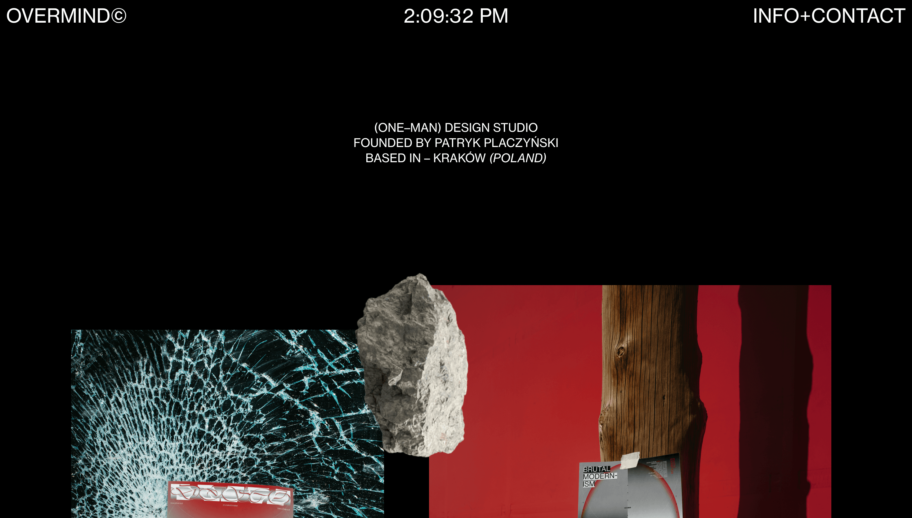
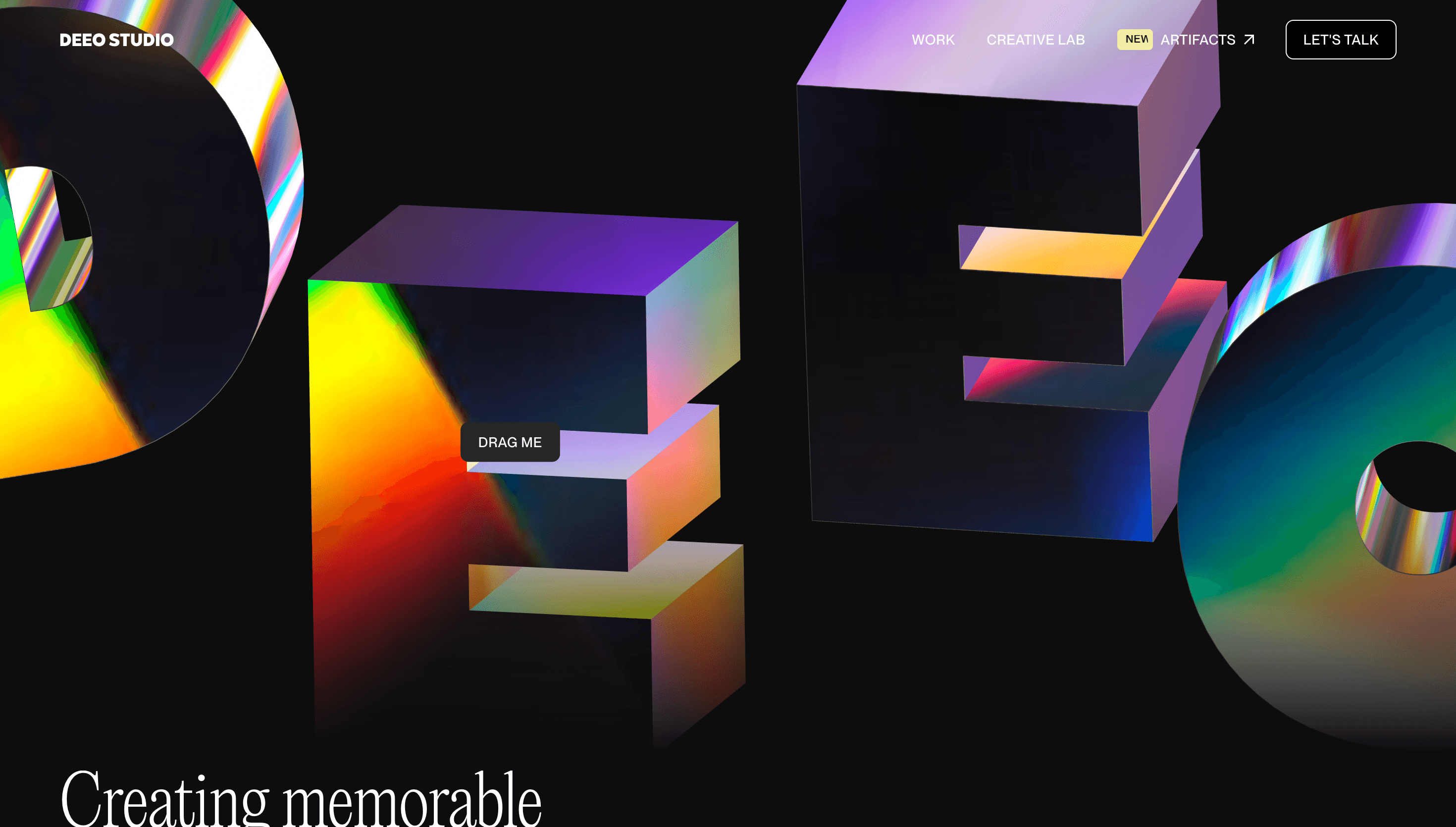
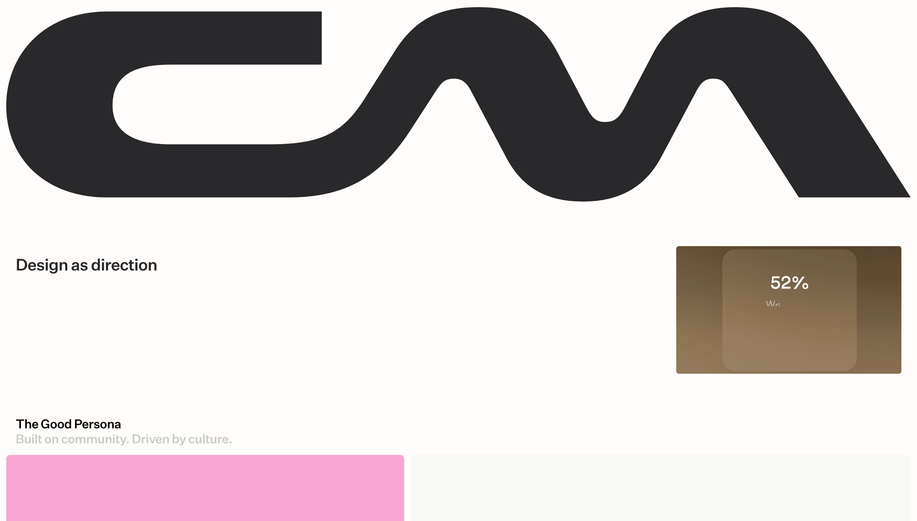
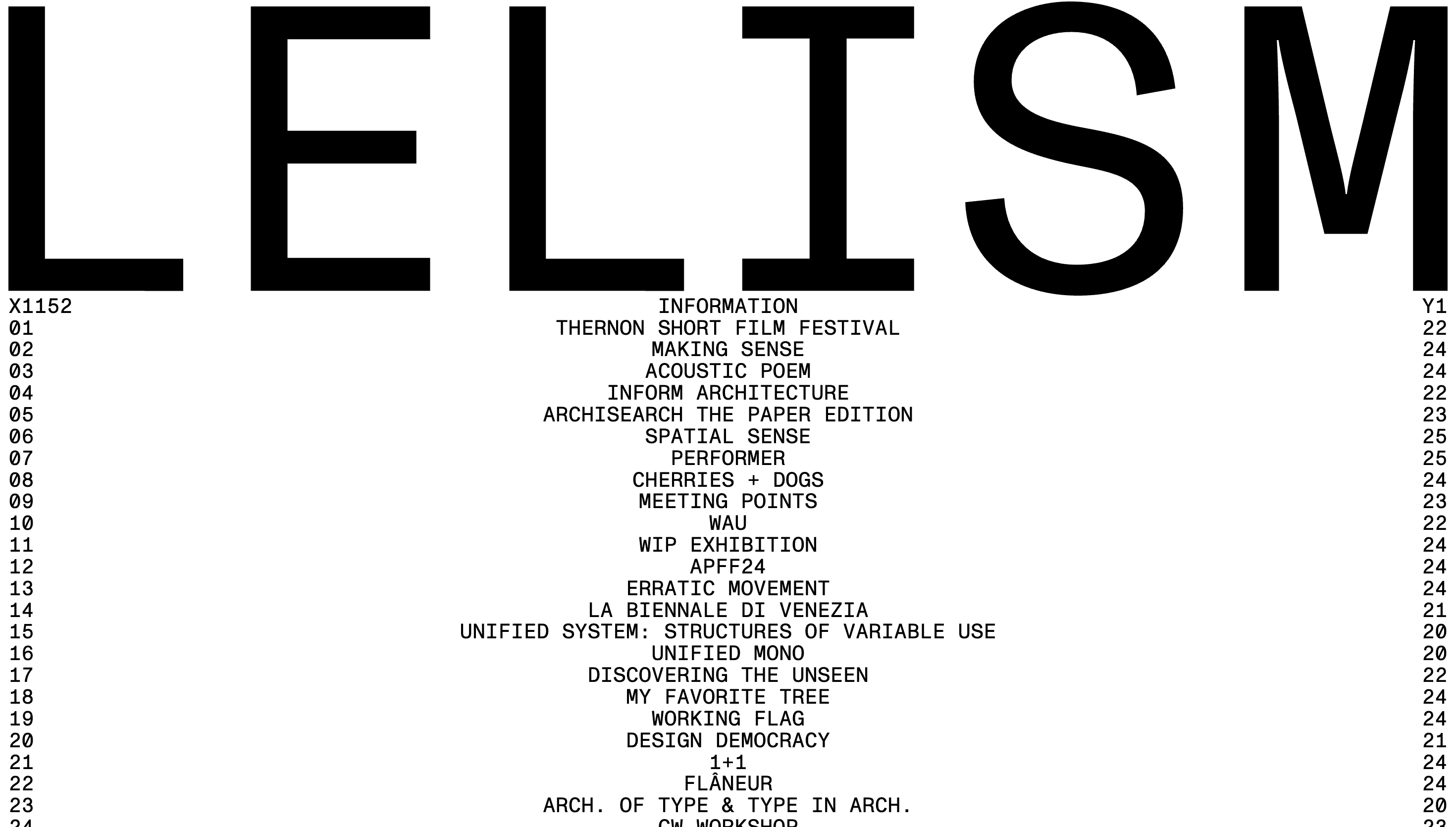
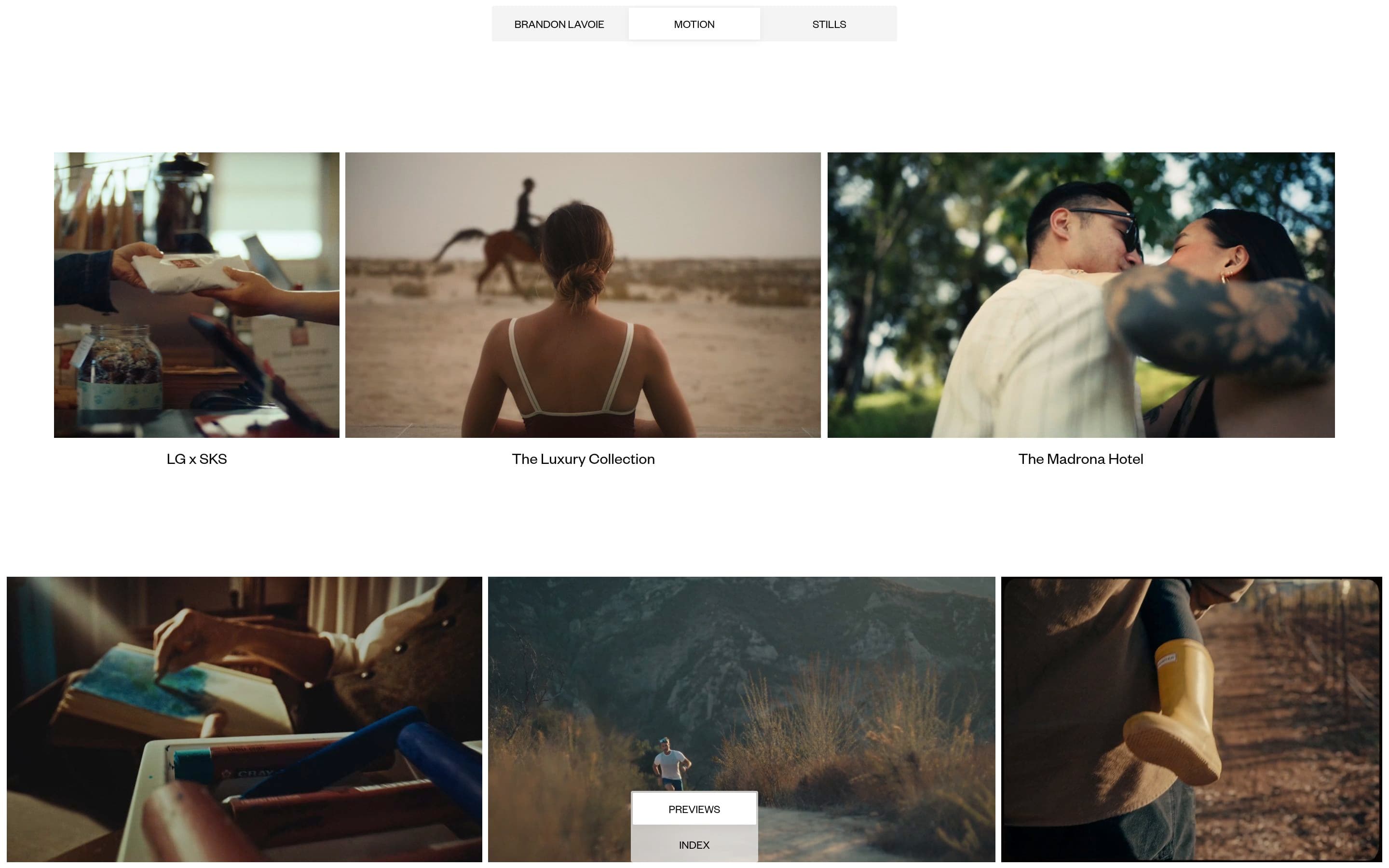
Brandon Lavoie's studio site serves as a minimalist digital archive for his creative output. The platform prioritizes clarity and focus, positioning the work as the primary subject within a structured, grid-based environment. It functions as both a professional portfolio and a personal brand statement for high-end design services.
Visual Language & Motion
The aesthetic is rooted in modern minimalism, utilizing a sophisticated typographic hierarchy and a clean layout. Subtle transitions and smooth scrolling enhance the browsing experience without distracting from the content. The use of negative space creates a sense of luxury and precision throughout the project galleries.
UX & Performance
Navigation is intuitive and streamlined, allowing users to move between projects with minimal friction. The site is optimized for fast loading times and responsive behavior across various devices, ensuring the high-quality imagery remains the focal point. Technical execution is clean, reflecting the studio's attention to detail in digital craftsmanship.
Takeaway
This site is an excellent example of how a less is more approach can elevate a professional portfolio. It demonstrates that a strong typographic foundation and a disciplined layout are often more effective than over-the-top visual effects for showcasing creative work.