Visit website
Boc.Studio
Published Oct 1, 2026
What it is
Boc.Studio is a Barcelona-based creative agency that focuses on creating and refreshing brands. Their services include brand identity, motion design, strategy, and artificial intelligence production for clients across various industries such as sports, food, and technology.
Visual direction
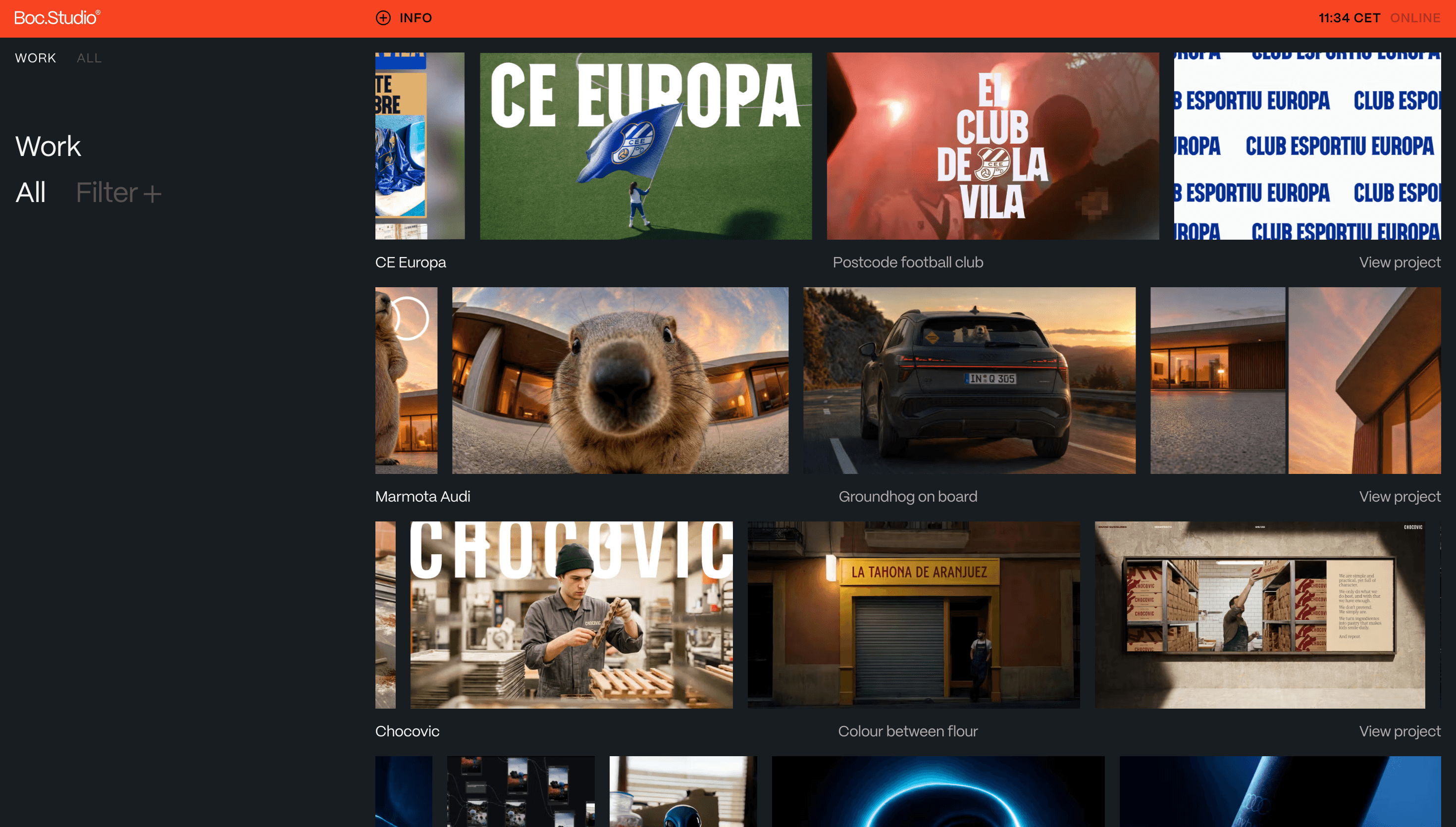
The visual presentation uses a high-contrast palette featuring a vibrant orange background with black sans-serif typography. The layout is centered and minimalist, focusing on a large-scale wordmark with a registered trademark symbol. The design relies on bold color blocks and clean typographic hierarchy to establish brand presence.
Structure & content
The page is organized around a Work section that displays a portfolio of projects including CE Europa, Audi, and Chocovic. Content is categorized by a filter system covering disciplines like Art Direction, Brand Identity, Campaign, and Generative Systems. Each project entry includes the client name, a brief descriptive tagline, and a link to view the full project.
Why study it
The site demonstrates a minimalist approach to agency branding by using a single bold color and large-scale typography to create a distinct visual identity. It also shows how to integrate diverse service offerings like AI production and generative systems alongside traditional brand identity within a unified portfolio structure.